Travel Agency Tribes
2025-08-28T21:54:30Z
PROJECT OVERVIEW
DURATION: 2 MONTHS
TEAM: Designer and Front End Developer, Engineer, Marketing
Travel Agency Tribes is a Canadian-based company dedicated to helping independent travel agents and small travel businesses establish a professional digital presence. Unlike larger agencies with marketing budgets and IT teams, many independent agents rely on word-of-mouth or social media, but often lack websites that feel professional, customizable, and easy to update.
The company’s vision was to bridge this gap by creating a system of ready-made digital landing pages, much like Carrd or Linktree, but designed specifically for the travel industry. The product needed to be:
Simple to use — agents should be able to launch a page in minutes.
Visually striking — modern templates that convey excitement, wanderlust, and professionalism.
Customizable — while offering ready-to-use templates, the system needed flexibility to adapt to each agency’s unique brand identity.
My role was to lead product design and implementation. I designed and coded 30 modular templates, each one reflecting global travel themes while being easily customizable by agents. Beyond designing the visuals, I engineered a reusable component system so templates could be scaled, maintained, and extended efficiently.
PROBLEM STATEMENT
Independent travel agents face a unique set of challenges when it comes to their digital presence:
Limited technical expertise: Many agents don’t have the knowledge (or time) to set up a WordPress site or manage a CMS.
Budget constraints: Hiring designers or developers for custom sites is expensive.
Clarity is key: Travelers don’t want to wade through long pages; they need information quickly and clearly.
Customization matters: A one-size-fits-all landing page won’t work — agents want to reflect their personality, destinations, and style.
The challenge for Travel Agency Tribes was to fill the gap between simplicity and power: a product that was as easy as Linktree but as beautiful and immersive as a travel brochure.
RESEARCH
Competitor Analysis

I studied Carrd, Linktree, and Squarespace in depth, analyzing how they structured onboarding, customization, and templates. I mapped out their strengths and weaknesses for the travel use case:
Carrd: extremely fast setup, modular, but visually flat. Lacked depth or destination-rich layouts.
Linktree: brilliant for social creators but too minimal. Travel agencies need to show photos, testimonials, and destinations — not just links.
Squarespace/Wix: feature-rich, but overcomplicated. Many travel agents don’t have time to learn design systems or page builders.
From this research, I identified the opportunity space:
Lightweight like Carrd, but visually rich.
Travel-specific storytelling baked into templates.
Customization-first so agencies could tweak without coding knowledge.
On-the-Ground Observations in Bali
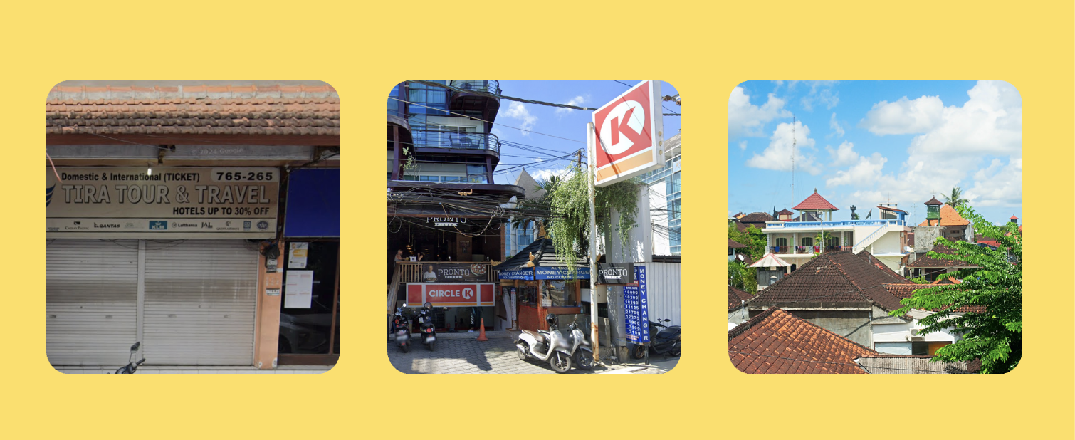
During this time, I was traveling in Bali and spent time observing how local travel agencies marketed themselves. Many relied on:
Flyers at hotels or cafes.
WhatsApp as the primary booking channel.
Simple Facebook or Instagram accounts instead of websites.
The problem was that these small businesses didn’t have digital platforms that truly reflected the richness of their offerings. Watching travelers interact with agencies in Bali influenced my design decisions:
Prioritizing mobile-first layouts, since most tourists search while already on the move.
Adding optional WhatsApp/Messenger contact buttons, because that’s how many agencies actually close sales.
Designing hero-first templates with bold imagery, travelers are drawn to destinations visually before they care about details.
By blending competitor insights with real-world agency behavior, I created a foundation that was not only modern but also grounded in practical travel business needs.
DESIGN PROCESS
I anchored the entire design system around three core principles:
1. Scalability
From the beginning, I treated this project not as 30 isolated templates but as a modular design system.
Built a reusable component library: headers, hero images, CTA blocks, link rows, testimonial sections, and social buttons could be combined in different ways to generate unique templates.
Used a consistent spacing and typography scale, ensuring visual balance even across 30 variations.
Designed with future-proofing in mind: new templates could be added without breaking old ones.
This modular approach meant that the company could offer 30 templates now, but potentially 100+ later, without losing cohesion or needing to rebuild everything.
2. Conciseness
Travelers don’t want to scroll endlessly. Every template was designed for brevity and clarity:
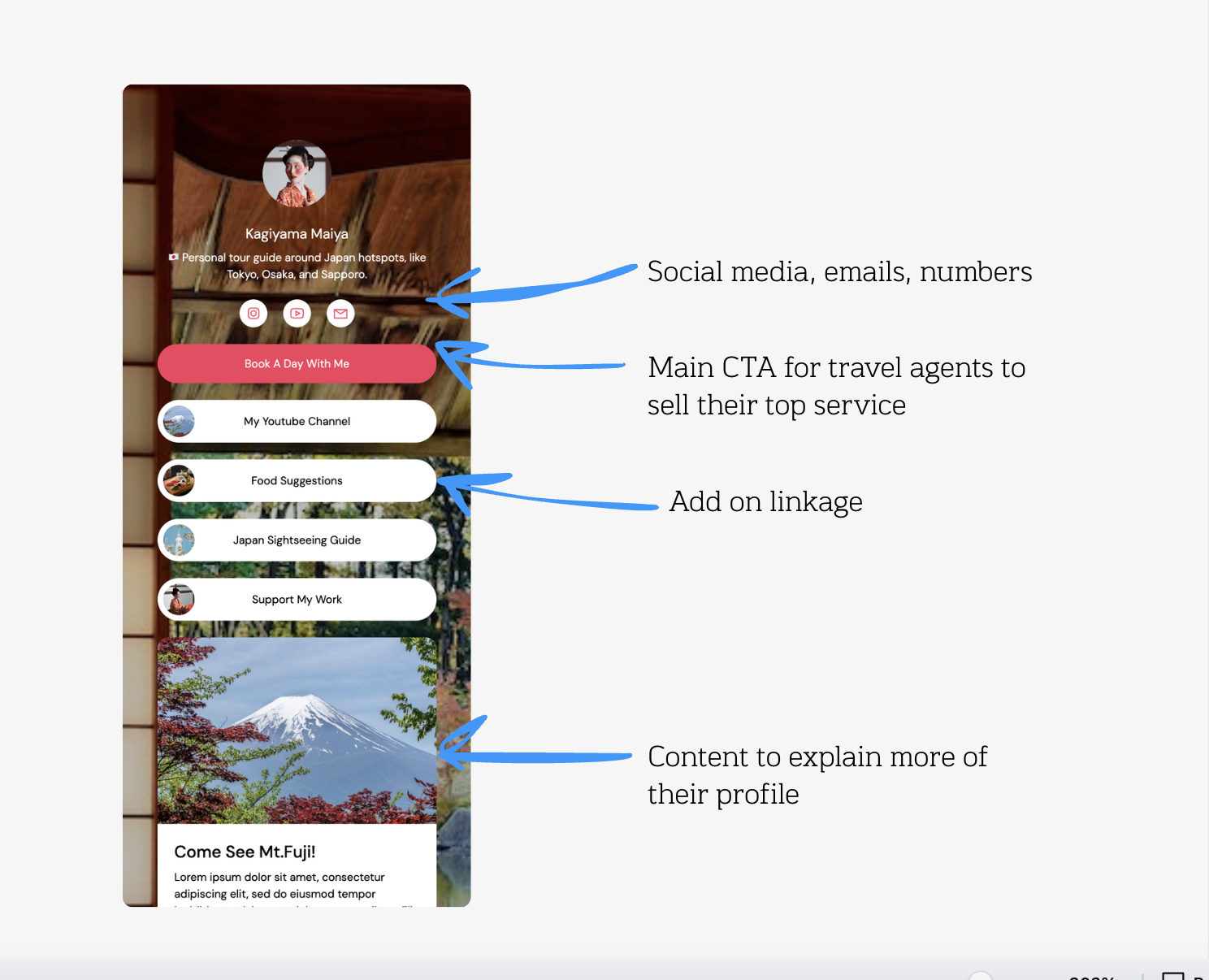
Hero + CTA at the top: "Book Now," "Get My Travel Tips," "Plan With Me."
Minimal copy blocks: short descriptions under each section.
Quick-access buttons: social media, contact, packages.
Prioritized scannability: typography hierarchy made sure headlines grabbed attention and body text stayed minimal.
The goal was to create sites that felt like digital business cards infused with storytelling.
3. Customizability
While templates provided structure, customizability empowered agents to make them their own:
Color themes: Agents could adjust button and background colors to match their brand.
Photos: Swap out destinations with their own images, keeping layouts intact.
Optional sections: Some agents wanted testimonials, others wanted YouTube embeds — I made sure each could be toggled on/off.
Social links: From Instagram to WhatsApp, agencies could choose what channels to highlight.
This balance of structure + freedom was key. Templates gave agents professional-looking designs instantly, but customization let them own the brand experience.
COLLABORATION & DEVELOPMENT
Though I led design and implementation, collaboration was central:
With the marketer, I refined templates to match customer expectations. For example, their input confirmed the importance of including WhatsApp buttons — a channel most agents rely on.
With the backend engineer, I ensured the component system integrated smoothly with the database, so agents could input content once and see it flow into any template.
Technically, I developed everything using a reusable component system (front-end, Tailwind CSS, JavaScript) to ensure scalability and maintainability.
OUTCOME & KEY TAKEAWAYS:
The final product delivered:
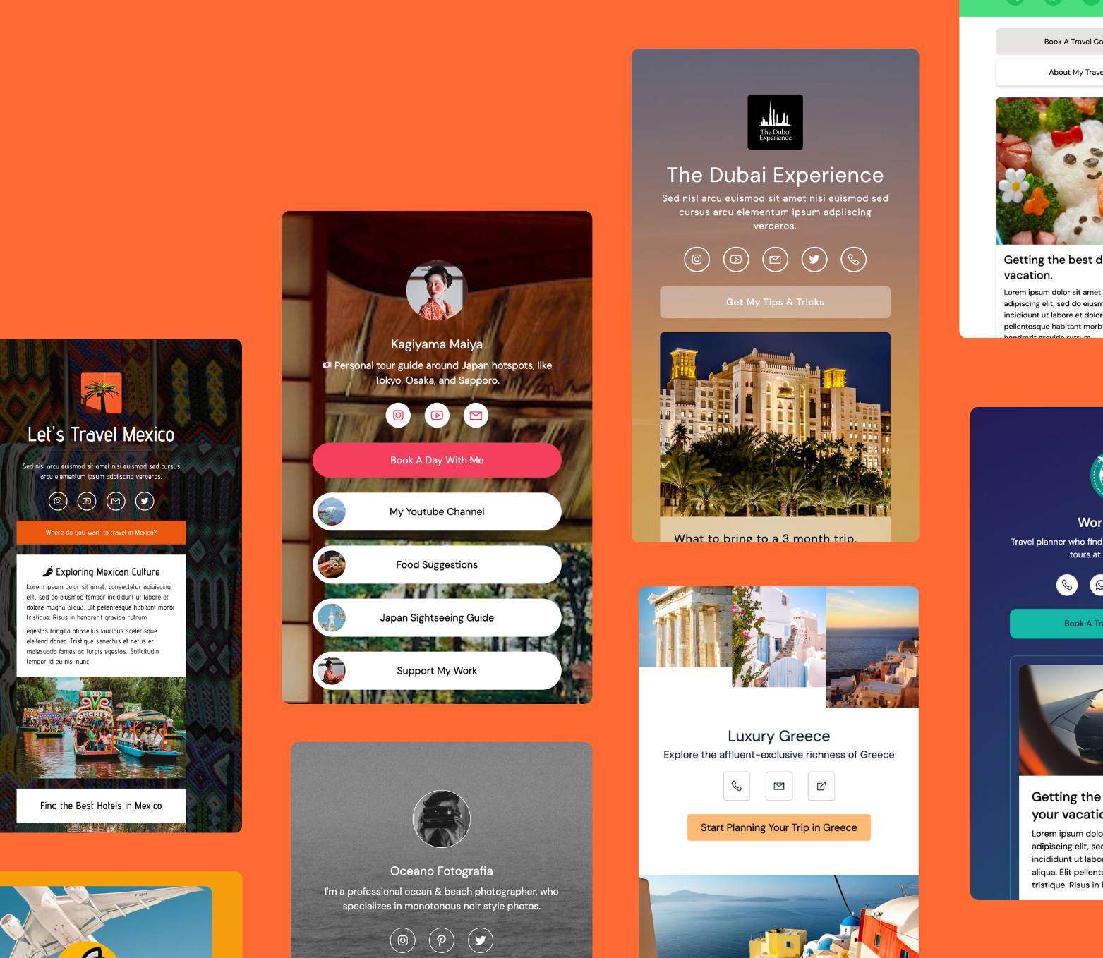
30 fully designed templates reflecting diverse global travel themes (Mexico, Greece, Dubai, Japan, etc.).
A lean, mobile-first experience optimized for travelers on the go.
A scalable system that can expand beyond the initial 30 templates with ease.
The project launched successfully, and while I don’t have specific adoption numbers, I received positive feedback from the company’s owner on both the visual design and implementation quality. The product is now in use with Travel Agency Tribes’ clients, helping travel agencies establish digital credibility quickly.
TAKEAWAYS:
No project is without its lessons. A critical takeaway for me was the need to stress-test templates with extreme content inputs. While most agencies used them as intended, some uploaded unusually formatted content or oversized blocks of text that disrupted the flow.
In future iterations, I would:
Add guardrails to handle extreme inputs (dynamic resizing, auto-truncation, responsive text scaling).
Provide live previews to help agents see how their content will display before publishing.
Expand the component system to include more adaptive blocks that can flex based on content density.
This experience reinforced the importance of not just designing for the “ideal case,” but also for the unexpected ways real users interact with templates.
By focusing on scalability, conciseness, and customizability, I delivered a product that meets agents where they are, while positioning Travel Agency Tribes to scale their offering to many more clients in the future.
For me, the biggest success was seeing how design choices rooted in real-world observations (like Bali’s small agencies relying on WhatsApp) could directly influence product features and make a meaningful difference.