ROLE
ux designer +
frontend developer
TIMELINE
1 month
INDUSTRY
food & beverage 2023
TEAM
owner, chef, me
about the job
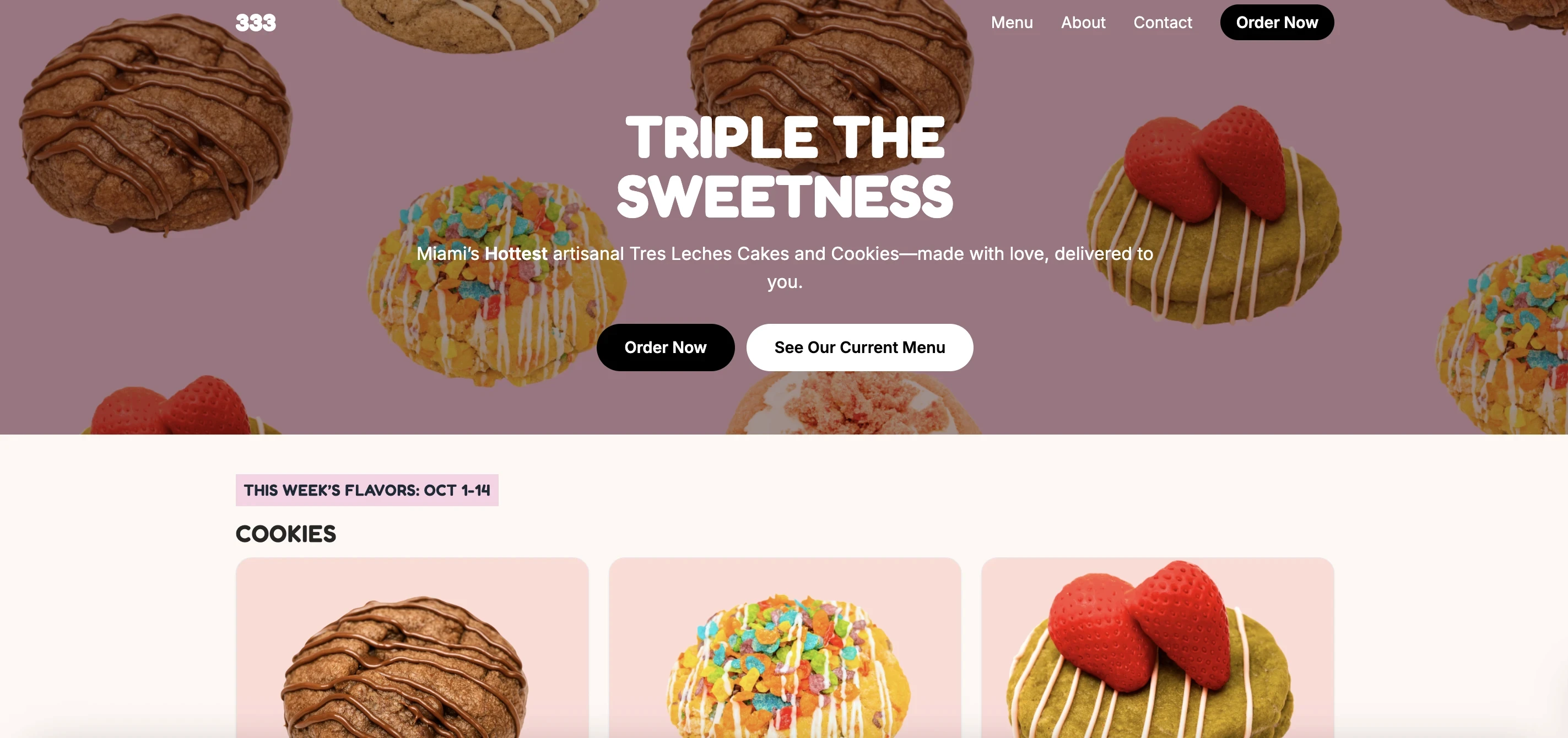
tres tres tres leches is a beloved cutler bay bakery known for handmade cookies and tres leches cakes. all their orders came through instagram dms — confusing to manage, easy to lose, impossible to scale.
i designed and built a site that moved them from inbox chaos to a guided ordering experience. within the first month, the site had direct digital orders and 6 new customers who'd never found them before.
THE PROBLEM
every sale lived in someone's direct messages
no menu. no pricing page. no allergy info. just the owner, managing hundreds of messages a day by hand.
customers were ready to order — they just couldn't figure out how.
RESEARCH
i started by just watching.
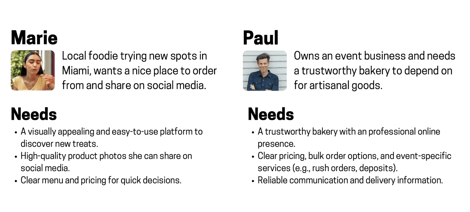
i spent time with the owner, observed how orders actually came in, and surveyed twelve returning customers. what came back wasn't just usability data — it was a picture of how people emotionally relate to food.
people don't just buy desserts. they buy delight. the site had to make that delight clickable.

What emerged was a pattern — people don’t just buy desserts, they buy delight.
The new website had to make that delight clickable.
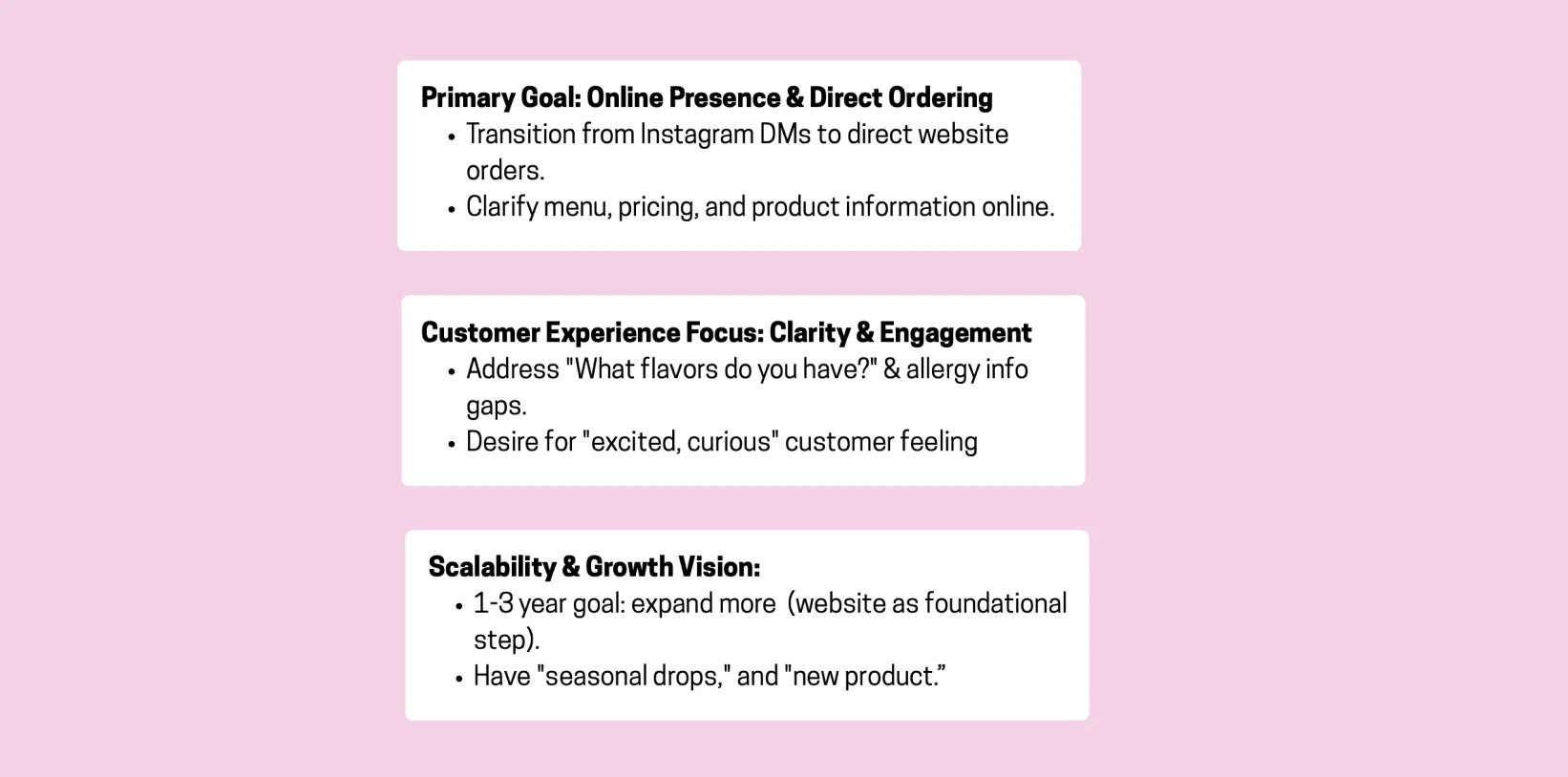
the owner's vision was just as clear.
she wanted her brand to feel personal and alive — not like a corporate e-commerce store. highlight the drops. share the stories behind flavors. make customers feel connected, not converted.
the design had to honor that humanity while introducing the efficiency she didn't have time to manage manually.
What emerged was a pattern — people don’t just buy desserts, they buy delight.
The new website had to make that delight clickable.
INSPIRATION
what the competitors taught me
i spent time with the owner, observed how orders actually came in, and surveyed twelve returning customers. what came back wasn't just usability data — it was a picture of how people emotionally relate to food.
people don't just buy desserts. they buy delight. the site had to make that delight clickable.

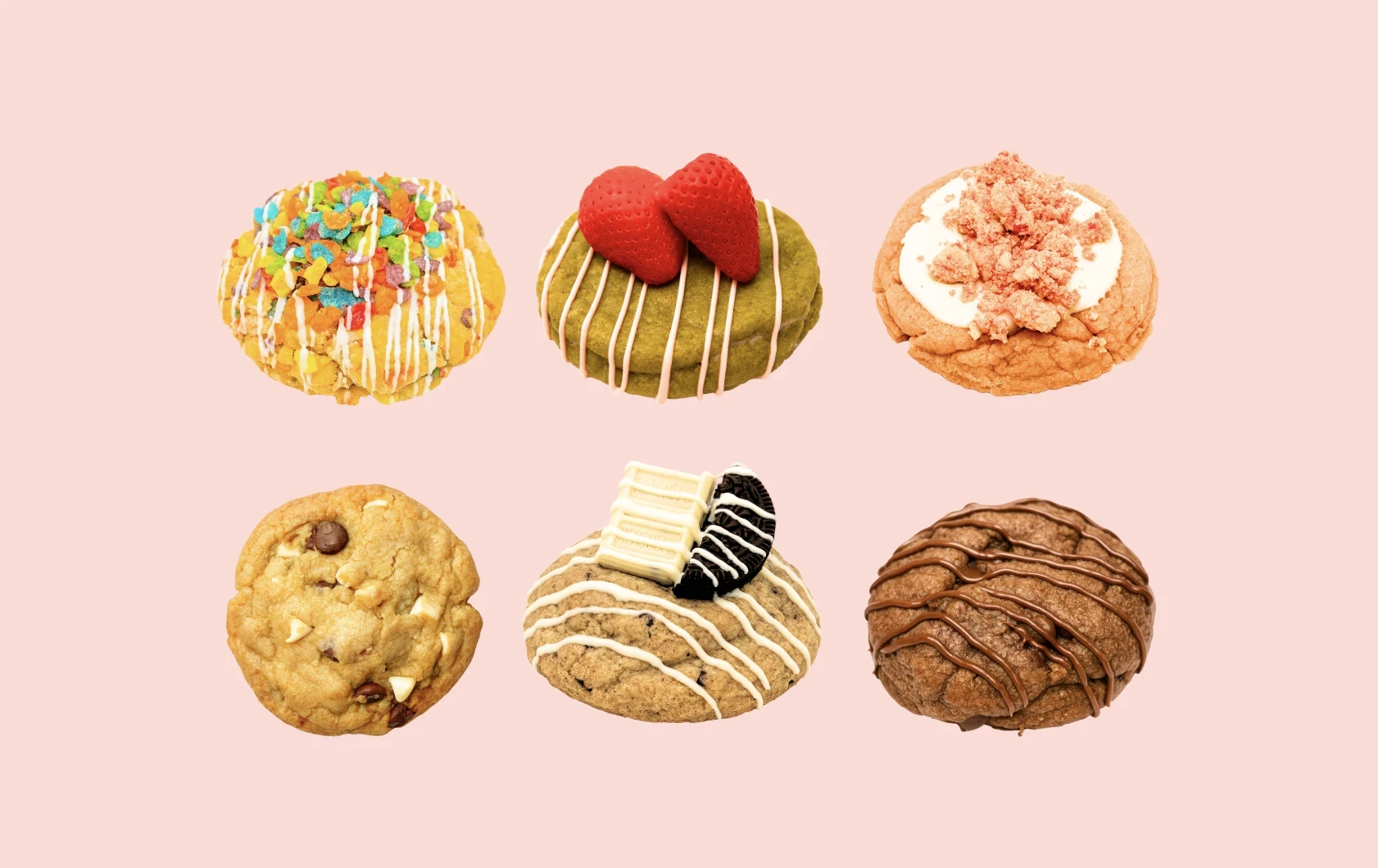
what stood out: the best bakery sites use imagery as interaction. customers understand flavor through photography, not copy. that became a core design principle.
—user personas
DESIGN PROCESS
the first version tried to solve everything at once.
allergies, seasonal menus, custom cake forms — all on one page. it looked thorough. it felt noisy.
i realized the site had the same problem as a kitchen with too many ingredients fighting for attention. so i stripped it back. each revision removed something until only the essentials remained: flavor, price, emotion.

what stood out: the best bakery sites use imagery as interaction. customers understand flavor through photography, not copy. that became a core design principle.
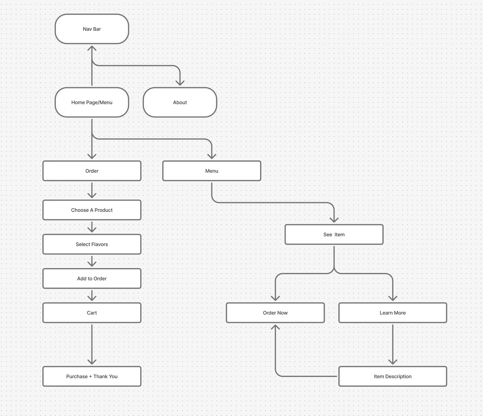
the order flow needed its own decision.
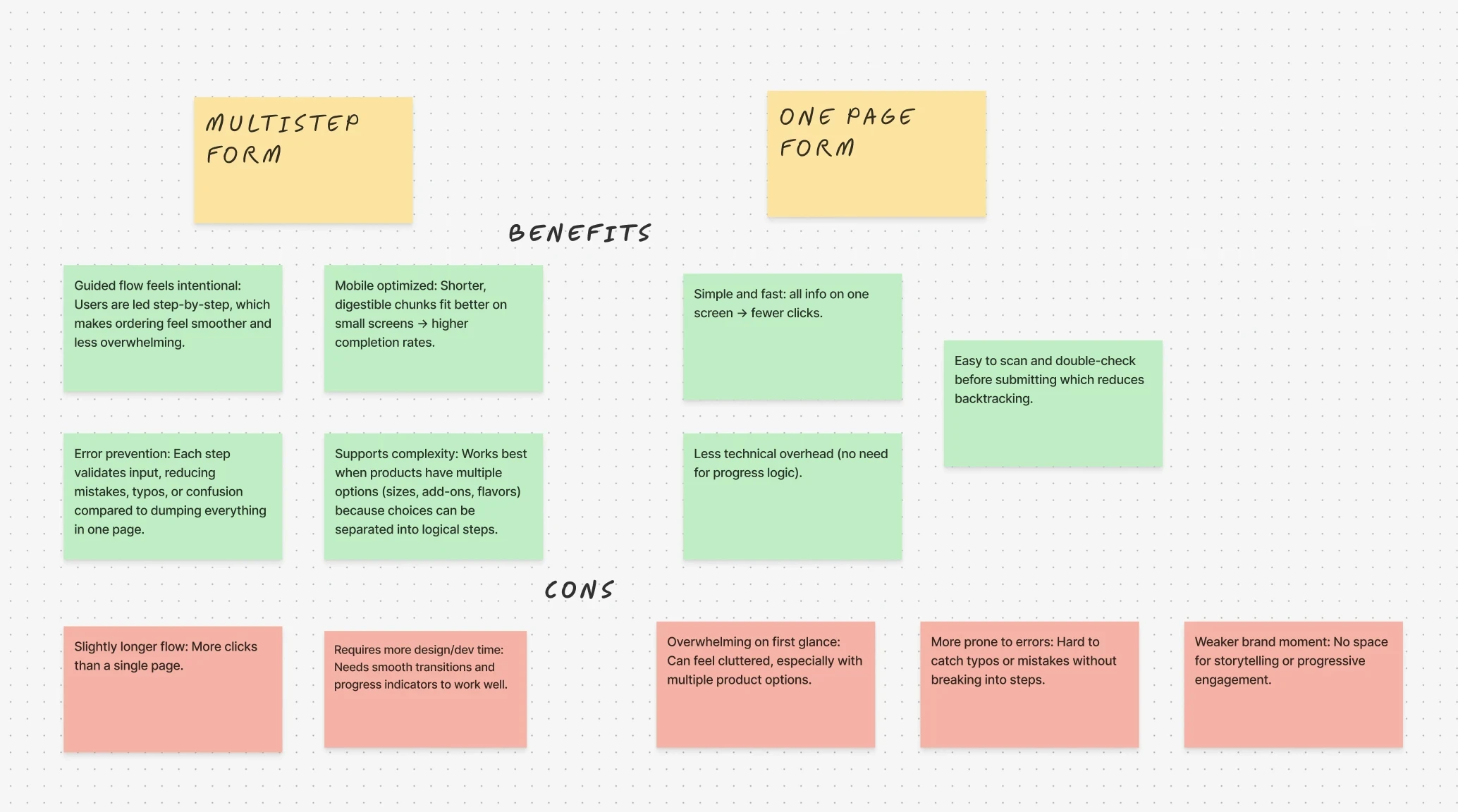
multi-step form or one-page form? i mapped the tradeoffs before committing.
Title
multi-step form or one-page form? i mapped the tradeoffs before committing.
Title
for a small bakery where trust and warmth mattered, the guided multi-step flow won.
RESEARCH
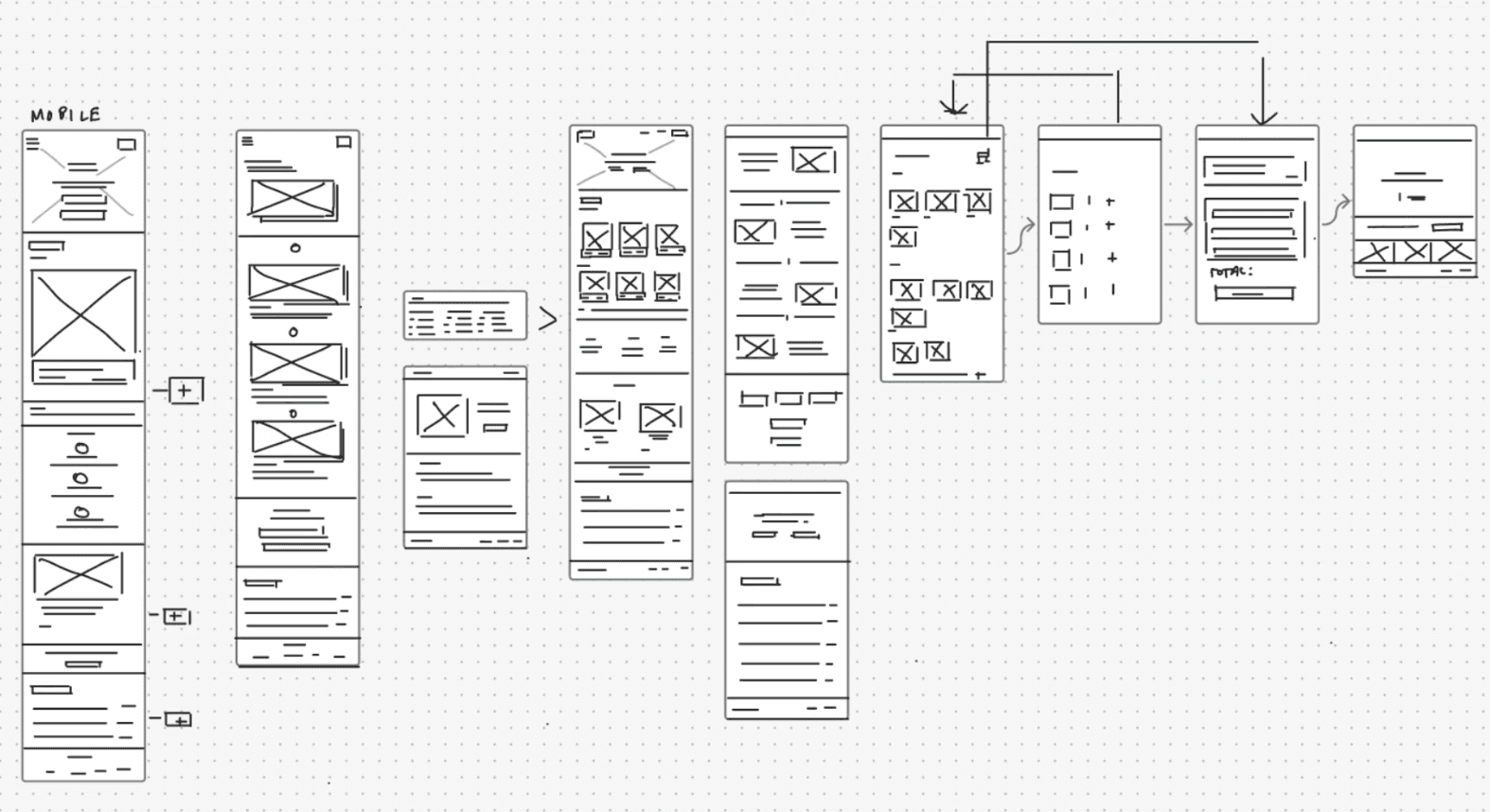
the audience was mobile-first, so the design was too.
thumb navigation. visible ctas. fast loading. a flavor gallery that made the product feel as good as it tasted in person.
"quick order," allergy-friendly icons, and a clear this-week's-flavors section gave customers exactly what they needed — without making them ask for it.

What emerged was a pattern — people don’t just buy desserts, they buy delight.
The new website had to make that delight clickable.
TESTING
seo wasn't an afterthought.
the site was structured around search-informed keywords, clean metadata, and descriptive alt tags for every product photo.
a bakery this good deserved to be findable by people who didn't already follow them on instagram.
FINAL + TAKEAWAYS
in one month, dms became direct orders.

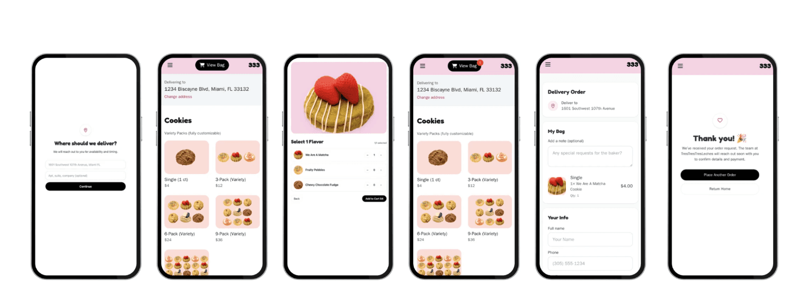

returning customers preferred the new experience
12 out of 12
placed first-time orders directly through the site.
6 new customers
is how the customers described the new site.
"fun","simple to use"
FINAL + TAKEAWAYS
what i learned
good design, like good food, comes from subtraction.
working on this reminded me of a line from the bear — the realization that the best things often come from taking things away, not adding more. digital transformation doesn't always mean complexity. sometimes it just means making the technology disappear so the product can speak.
subtraction isn't loss — it's refinement.
