Travel Agency Tribes is a Canadian company that helps independent travel agents build a professional digital presence. I designed a library of 30 customizable screen card templates — and the modular system that makes them all hold together. The product reached 1,500+ agencies at launch and is built to scale well beyond 30 templates without a redesign.
The context
Travel agencies wanted a way to promote their website, new services, and promotions at a glance. The company wanted to offer a connected product — a composable version of the SaaS product they already provided for agencies — essentially a new product line. We wanted a sister product to their main site that didn't feel like a separate part of the website, or like using a new company altogether. We specifically did not want to add another product agencies would have to sign up for and manage.
I compared multiple link-sharing sites to pick priorities...
I looked at popular sites including Carrd, Linktree, Squarespace, and Wix, weighing their pros and cons.
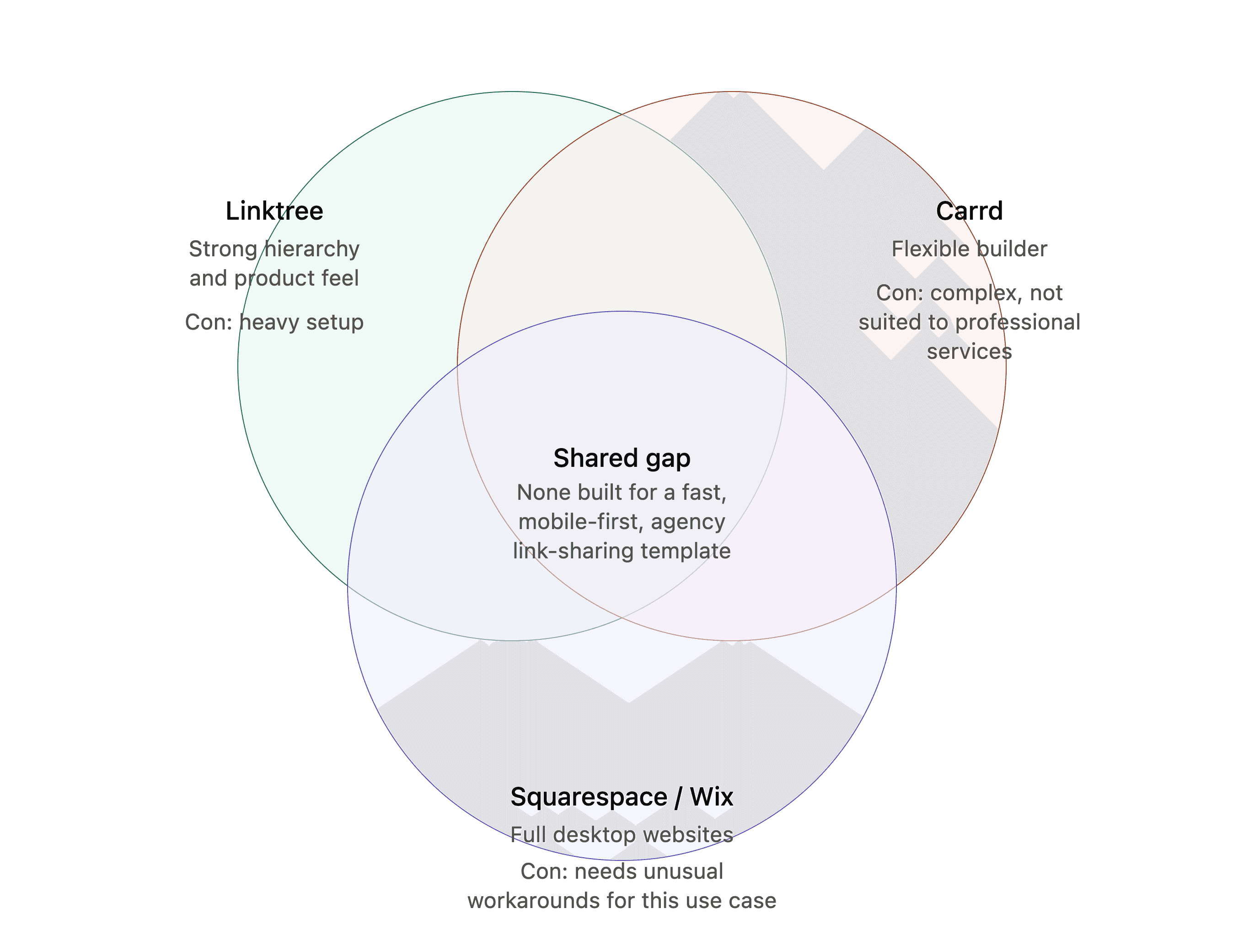
Linktree was the strongest in hierarchy and product design, though it required a lot of setup. Carrd was more complex and less optimal for professional services. Squarespace and Wix were built for full desktop websites and would have required unusual workarounds to fit this use case.
Personas
I was designing for two primary personas, plus a hidden third:
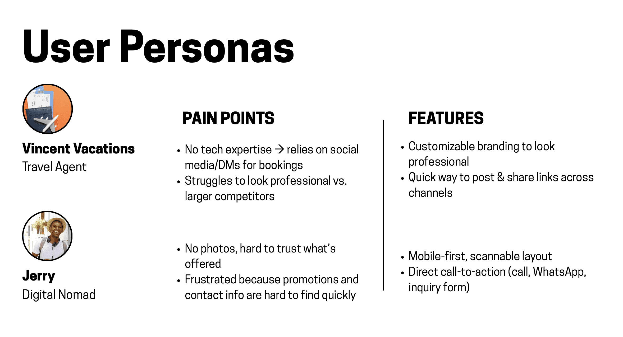
The larger agency — needed to concisely communicate their headline services
The smaller agency — needed to appear professional to customers and display their resources
(The customer) — needed fast, reliable information about their travel
Personal connection to the project
I had prior familiarity with travel tools. Having traveled frequently earlier in my life, I understood the frustrations from the customer's point of view, which fueled my design choices. Common issues I found across travel companies included:
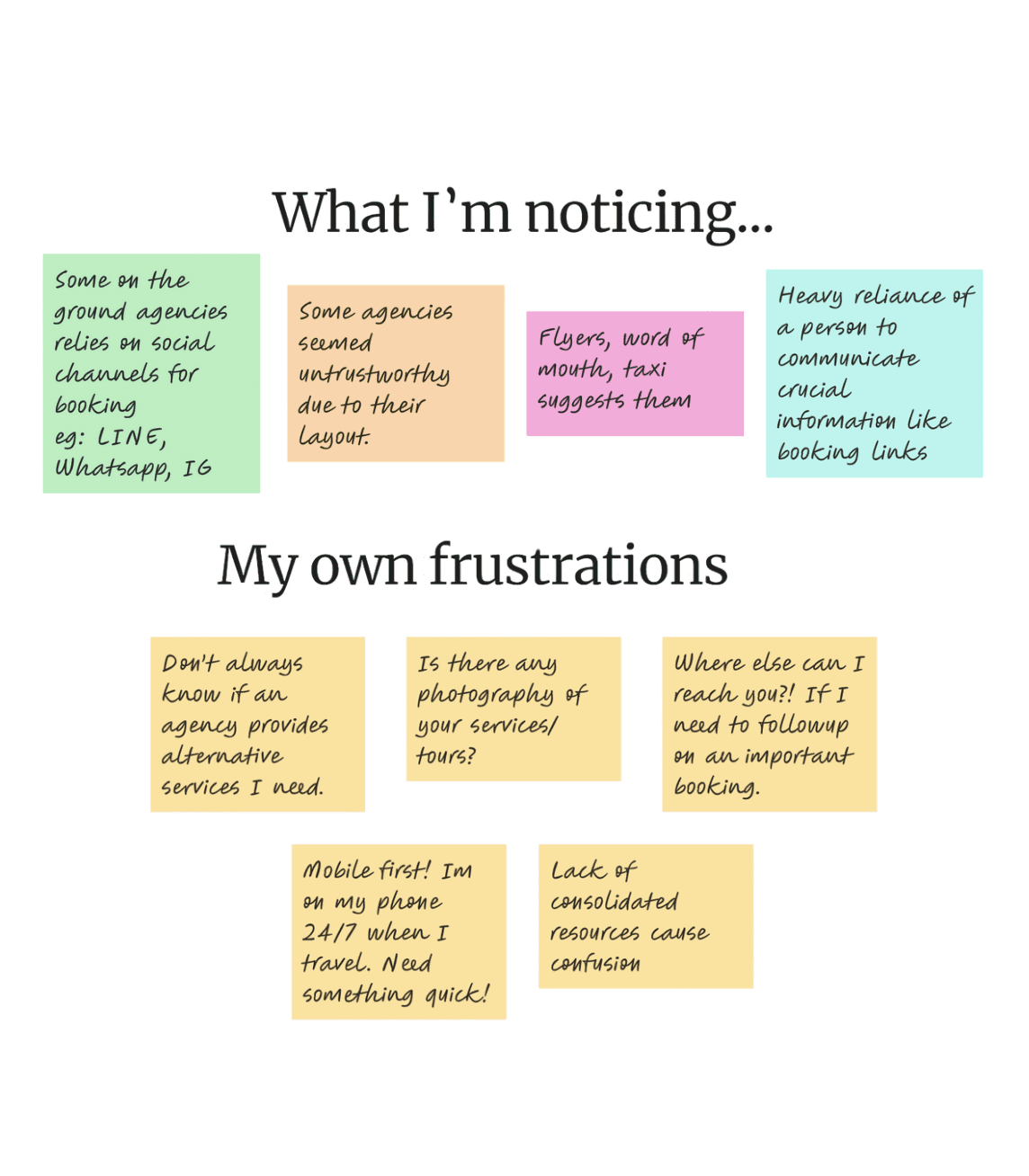
Information was scattered
Finding the travel information you needed was a maze.
Smaller companies relied on WhatsApp/Messenger, which looked unprofessional
reinforcing the idea that this sister product needed to serve smaller agencies who didn't want the full main product
Out-of-date information
services that no longer existed, expired promotions, no visibility into new offerings
I also looked into research validating that errors encountered early in a customer funnel significantly increase drop-off.
Setting up the patient zero to the product
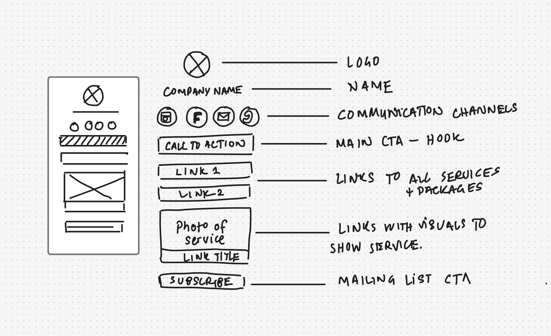
The first step was the skeleton of the project, which required the most thought. We had to treat this as a single modular product rather than a set of separate template entities. Using my competitive analysis, I built a structure familiar to linkage sites, but tailored specifically for travel agencies.
This meant designing for clear context, communication channels, focused CTAs, content links, and mailing lists — with information hierarchy as the core design principle. We experimented with different ways of prioritizing hierarchy and building modular components for customizability. Once the skeleton was discussed and approved with product and tech, template design began.
Exploring interface directions
Testing
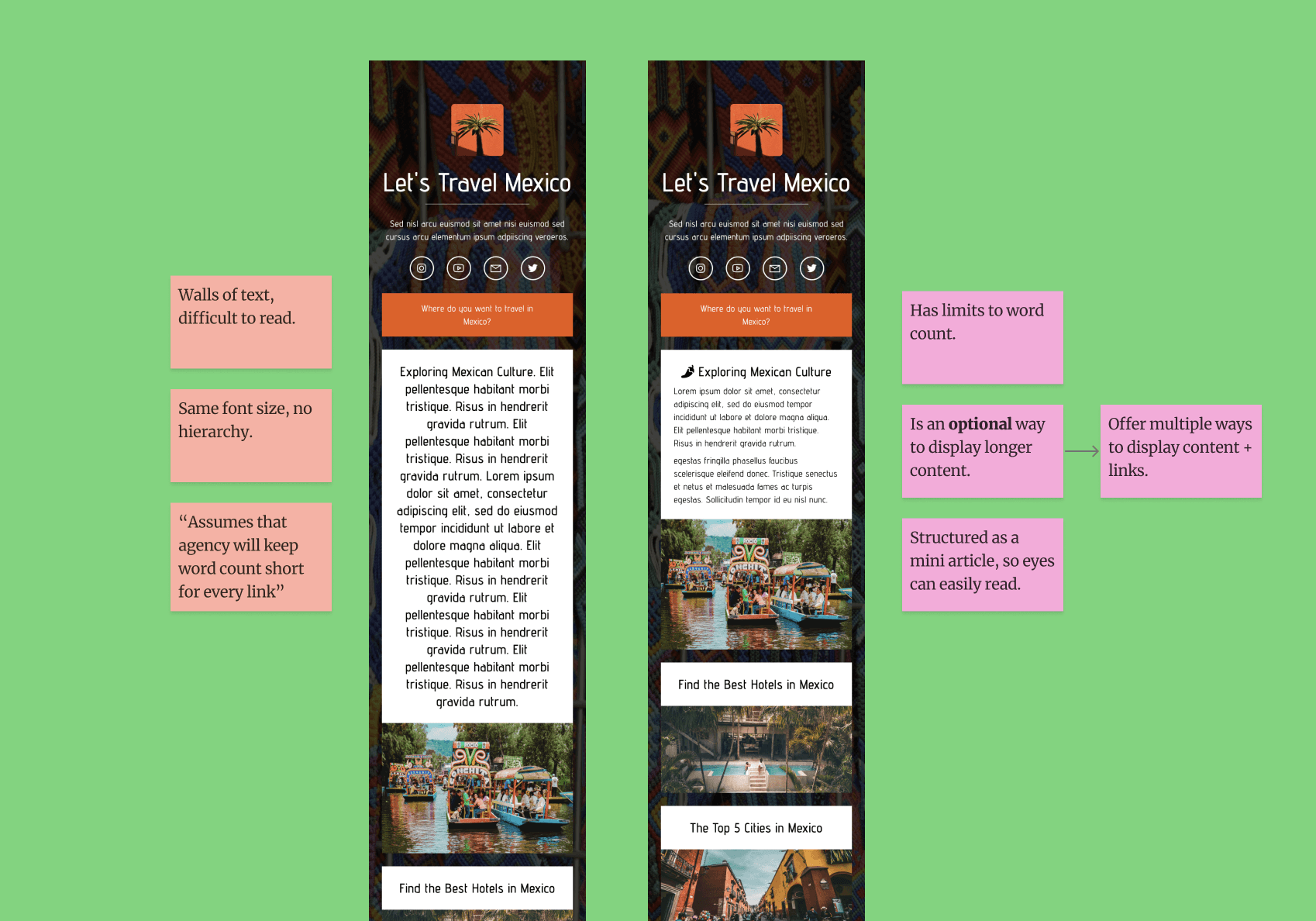
Agents pasted more text than the templates could support
We tested with agents already partnering with the company, which surfaced bugs and content scenarios we had missed. Some agents pasted long paragraphs into areas intended for short text, making it clear that our templates needed stronger content constraints.
We iterated on how information displayed and introduced limits on text length and placement. For example, we kept CTA text short and directed agents to place longer descriptions elsewhere.
This taught me to test designs with the content people actually use, including the cases that strain the layout.
Technical
Working with the backend engineer, I made sure components mapped cleanly to the database, so agents could enter content once and have it flow automatically into any template. The implementation used a reusable component system built in Tailwind CSS and JavaScript, designed to stay maintainable as the template library grows.

Final designs

The most enjoyable part was designing the templates themselves — I chose different countries as examples to showcase a variety of styles.
Results
1,500+
travel agencies received access at launch
solo agents
especially reported setup felt enjoyable, not overwhelming
30+
templates made in a modular component system for scalability
Design for expected chaos, not just the happy path.
Two main themes appeared during my time on this:
Test with the content people actually use.
Agents pasted long descriptions into spaces I had designed for short text. Testing with their own content exposed limitations that polished sample copy had hidden and helped me establish clearer rules for text length and placement.Customization needs thoughtful boundaries.
Designing different template styles meant considering how backgrounds, text, and content containers worked together. I learned to balance visual flexibility with constraints that kept information readable and actions easy to identify.