I designed and delivered Amlight’s new public network-insight portal, turning a jargon-heavy internal dashboard into a clear, mobile-ready experience for engineers, researchers, and prospective sponsors.
Amlight ferries petabytes of telescope traffic across the Americas
Yet the tool itself was only able to be understood by engineers. As the first UX-design intern at Amlight, my goal was to revise their current network portal so that it would be accessible not only to network engineers, but a broader audience. This would aim to achieve the the goal to communicate the value of the product to prospective sponsors.
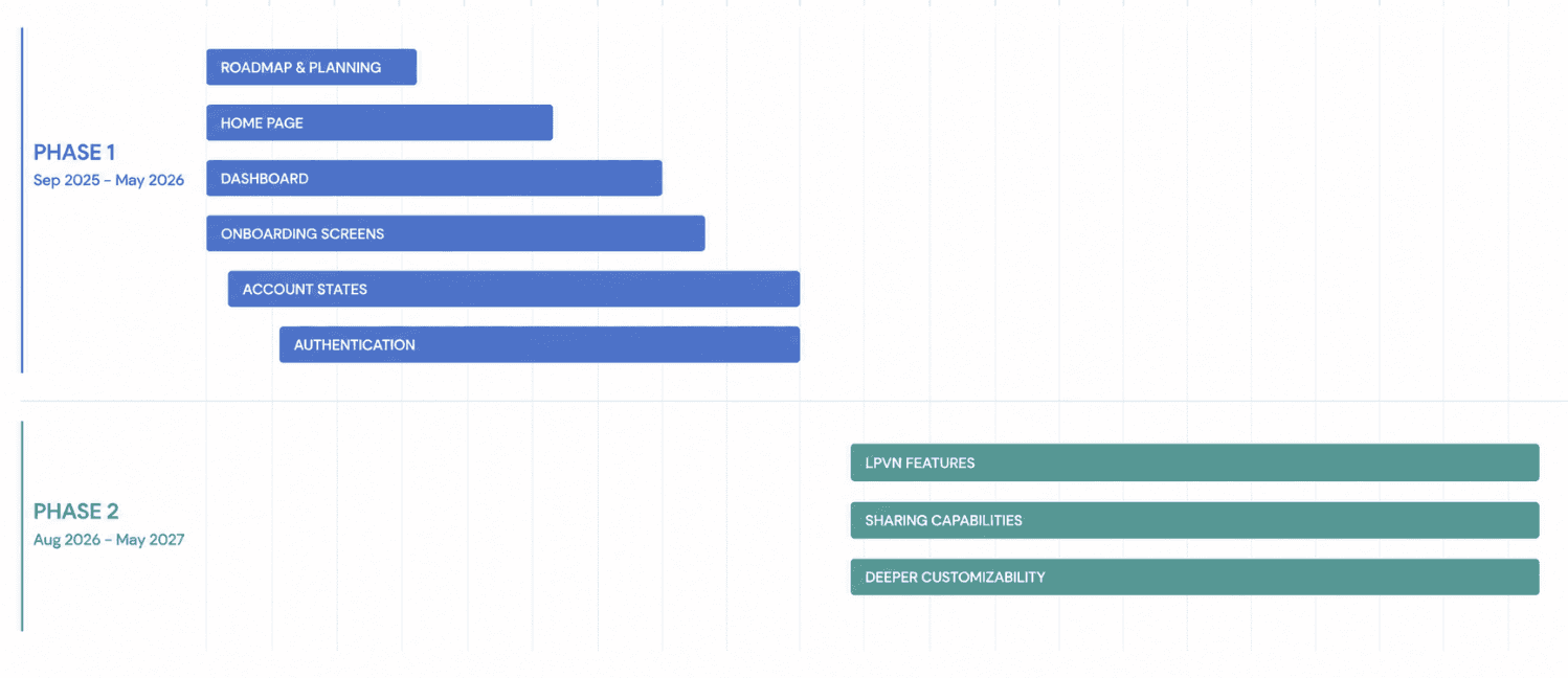
Project Roadmap
Who we are designing for
Technical Experts
Network engineers and SWEs who use the portal daily
Researchers
Those associated with the institution itself
Newcomers
Prospective institutional partners, non-specialist stakeholders, students
These groups identified the legacy tool “useful but impossible to market,” driving our redesign priorities from not only utility but usability and marketability.
Gathering all the information I needed to start
We began backwards, with a massive brainstorm with the head network engineering team on what they believed would be essential. By whiteboarding the initial entrance page, we generated ideas of what it could look like, and prioritized what should be displayed and could map or future priorities.
Studying sites like Grafana, ORCHID, and Google Analytics helped me to understand mental models around dashboards that had a lot of data.


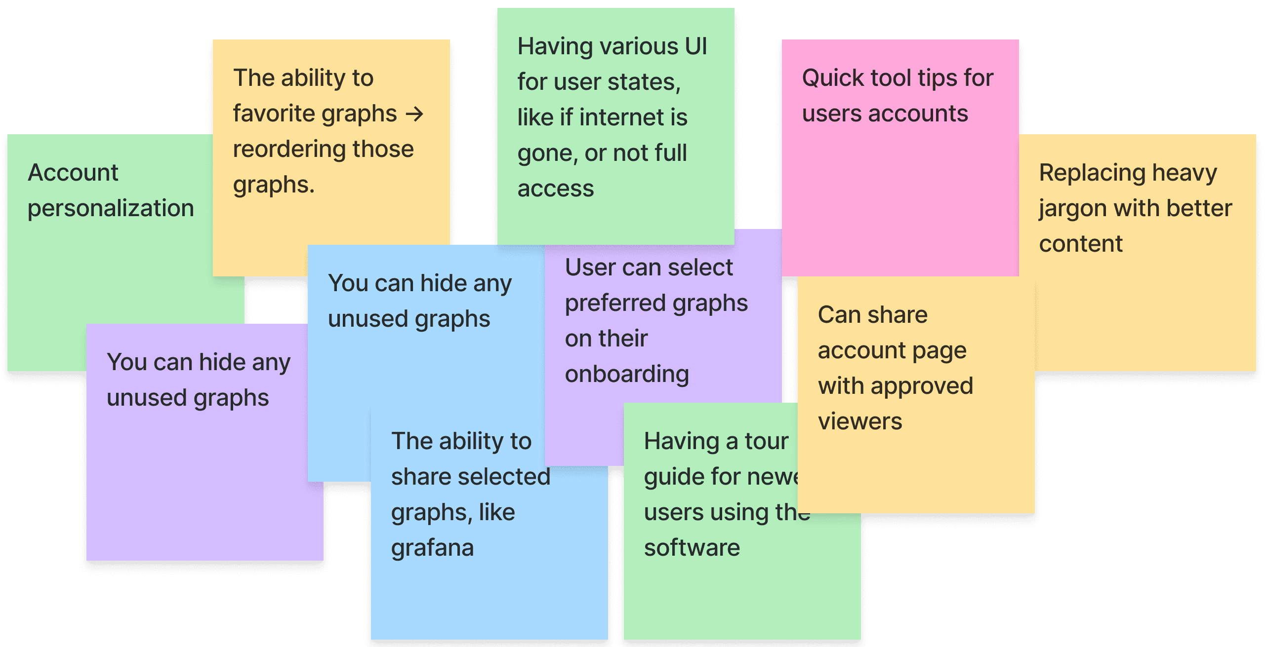
Hosting an ideation session with Developers
Design collaboration of the internal dashboard was one of the most fun parts of my experienece. I opened an ideation session with the developer team—both full-time network engineers and interns.
Design system
As a founding design intern, one of my most important tasks also included building a design system from preexisting sites that best represented the brand — which also meant collaborating with developers to know what states to design for (e.g., logged-in account states).
Exploring interface directions
Dashboard
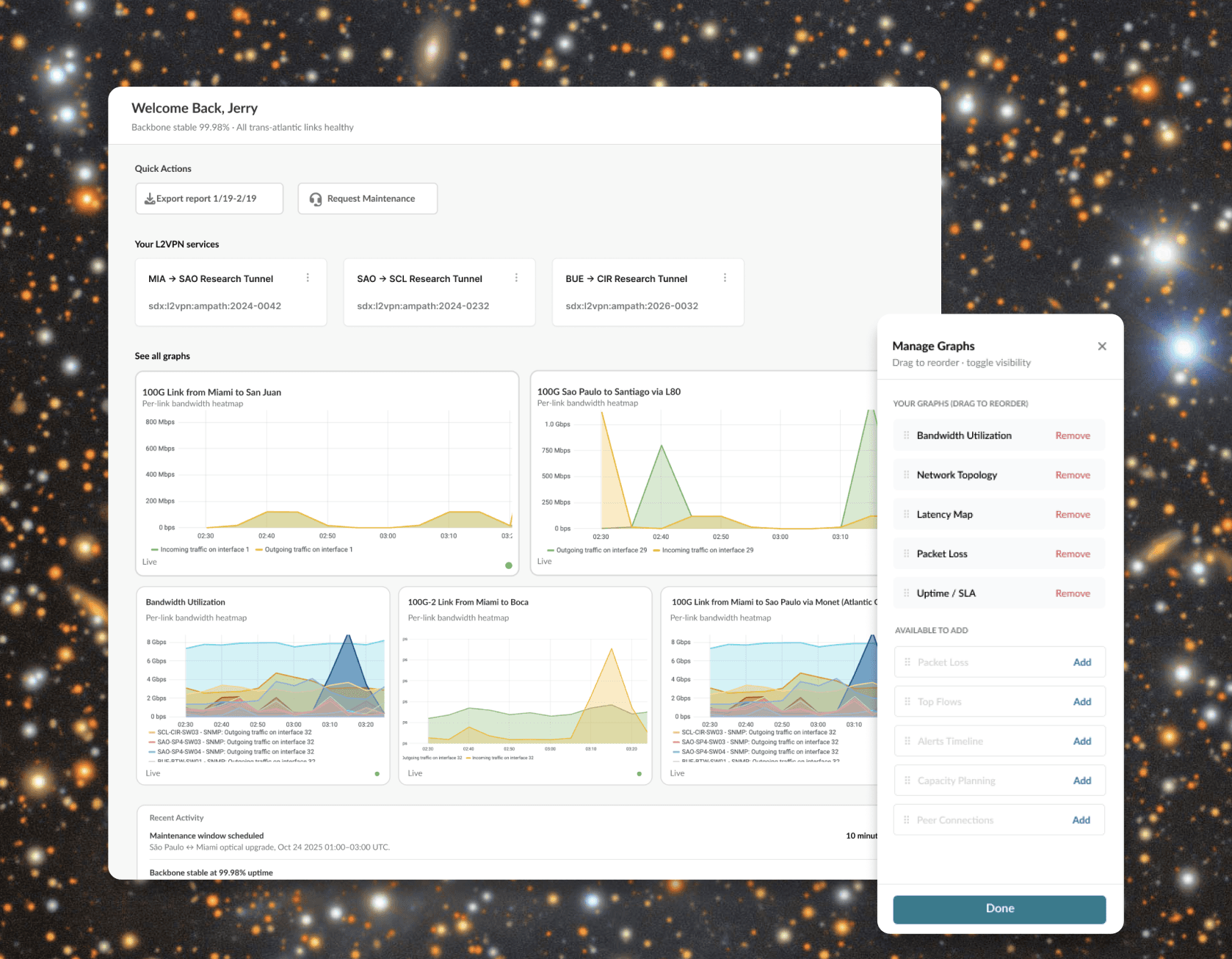
I designed a simple, high-level dashboard with personalization built in. Modularity was a key consideration — a thread that runs through most of my designs — and mobile viewing was a priority as well.

Onboarding
Letting users choose their graphs upfront, rather than overwhelming them with dozens at once, made for a much easier initial experience. A simplified starting view gave developers a natural entry point into onboarding, and the team saw real value in progressive disclosure here.
Homepage
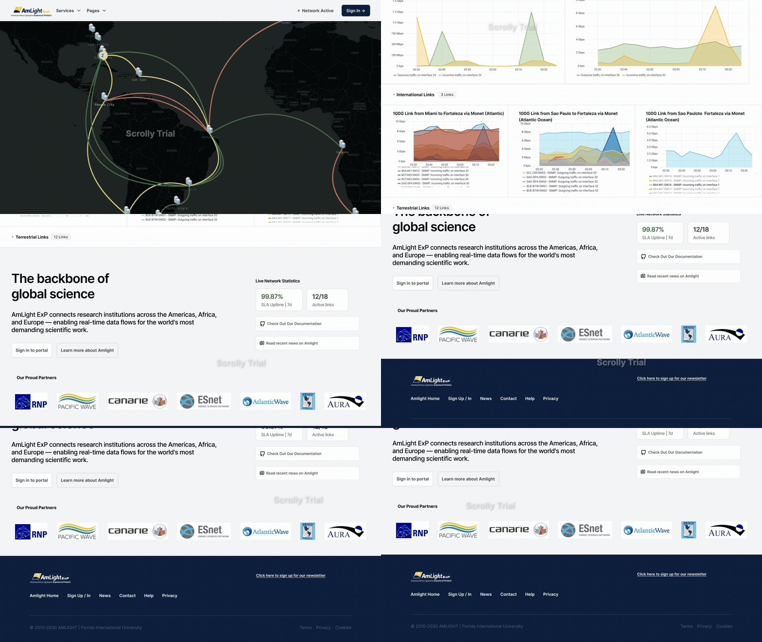
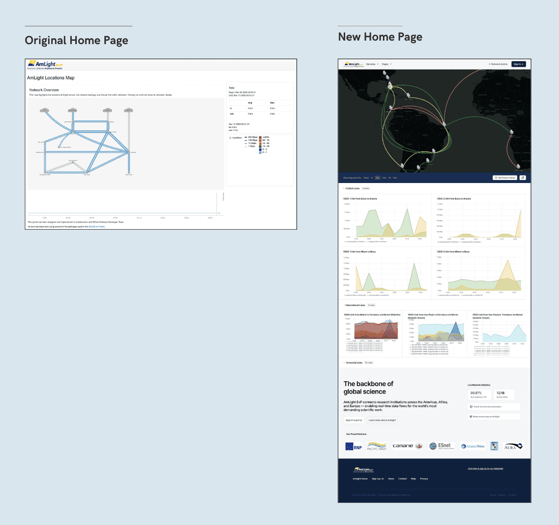
Importance of the right team
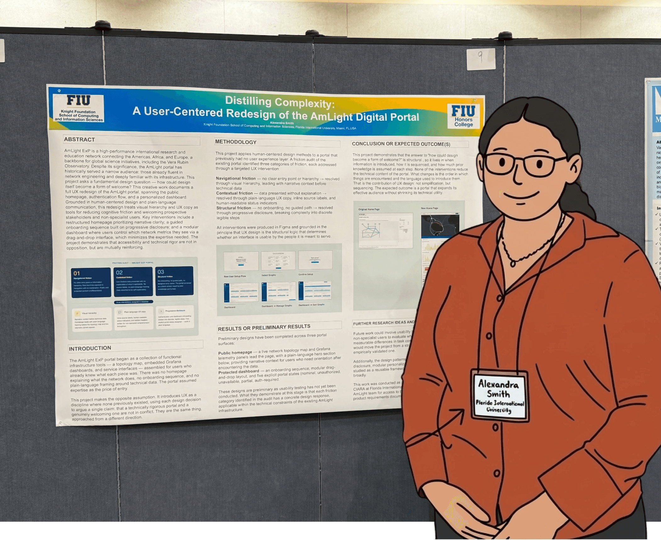
I am very grateful for my managers, Vasilka, Jeronimo, and Luis who always advocated for my growth and showed the importance of my role to senior leaders and the team as a whole. One of these pushes led my work in the form as a poster to URFIU that scored 9 and 10 from external judges and is slated for a Spring 2027 conference.
What holds in the future...
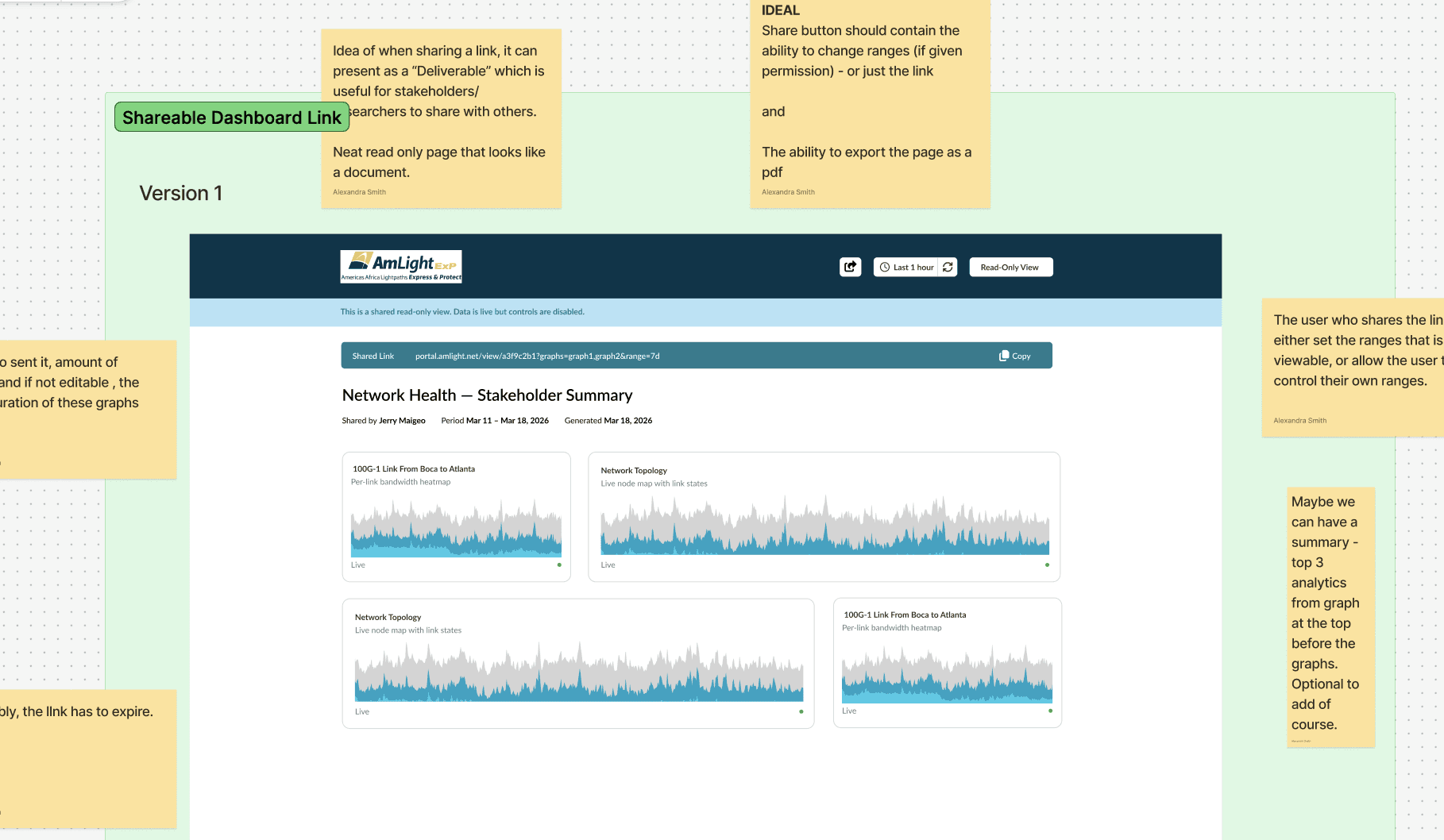
Our next phase involves how shared materials work. For executives and non-technical stakeholders, sharing a full dashboard isn't optimal. The vision is letting users select a timeline and generate it as a shareable report.
General Takeaways
Code-first prototypes engage engineers
Communication of design intent matters as much as the design itself. Static screens and guidelines weren't enough. Interactive prototypes that developers could explore made the difference.
Early discovery saves rework
More upfront discovery would have prevented mid-project pivots. We designed before fully understanding all requirements, leading to scope creep.
Team matters.
Mentors who advocated for my growth and showed leadership my contributions made the entire experience possible.