I joined the design team to redesign the pricing quotes screen. There were 2 goals, improving the information hierarchy, of how scenarios (a cluster of rates) looked, then creating a mobile ready screen.
What is Realfinity?
RealFinity is a Miami-based mortgage platform that connects borrowers with wholesale lenders to surface competitive loan rates. During my internship, I joined the design team to redesign the pricing quotes screen. There were 2 goals: improving the information hierarchy of how scenarios (a cluster of rates) looked, then creating a mobile ready screen.
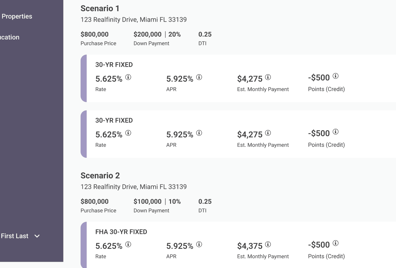
The scenarios blended together
It started with looking at the current audit of the site, assessing the state, and dealing with micro challenges of how I would redesign some of the original portions to familiarize myself with the components and design system. After those smaller projects, my manager posed me the intricate challenge of redesigning and creating the new mobile experience of "Scenarios"
Looking Beyond Mortgage Products for Better Patterns
It started with looking at the current audit of the site, assessing its state, and dealing with micro challenges of how I would redesign some of the original portions to familiarize myself with the components and design system. After those smaller projects, my manager posed the more intricate challenge of redesigning and creating the new mobile experience.
Competitive Analysis
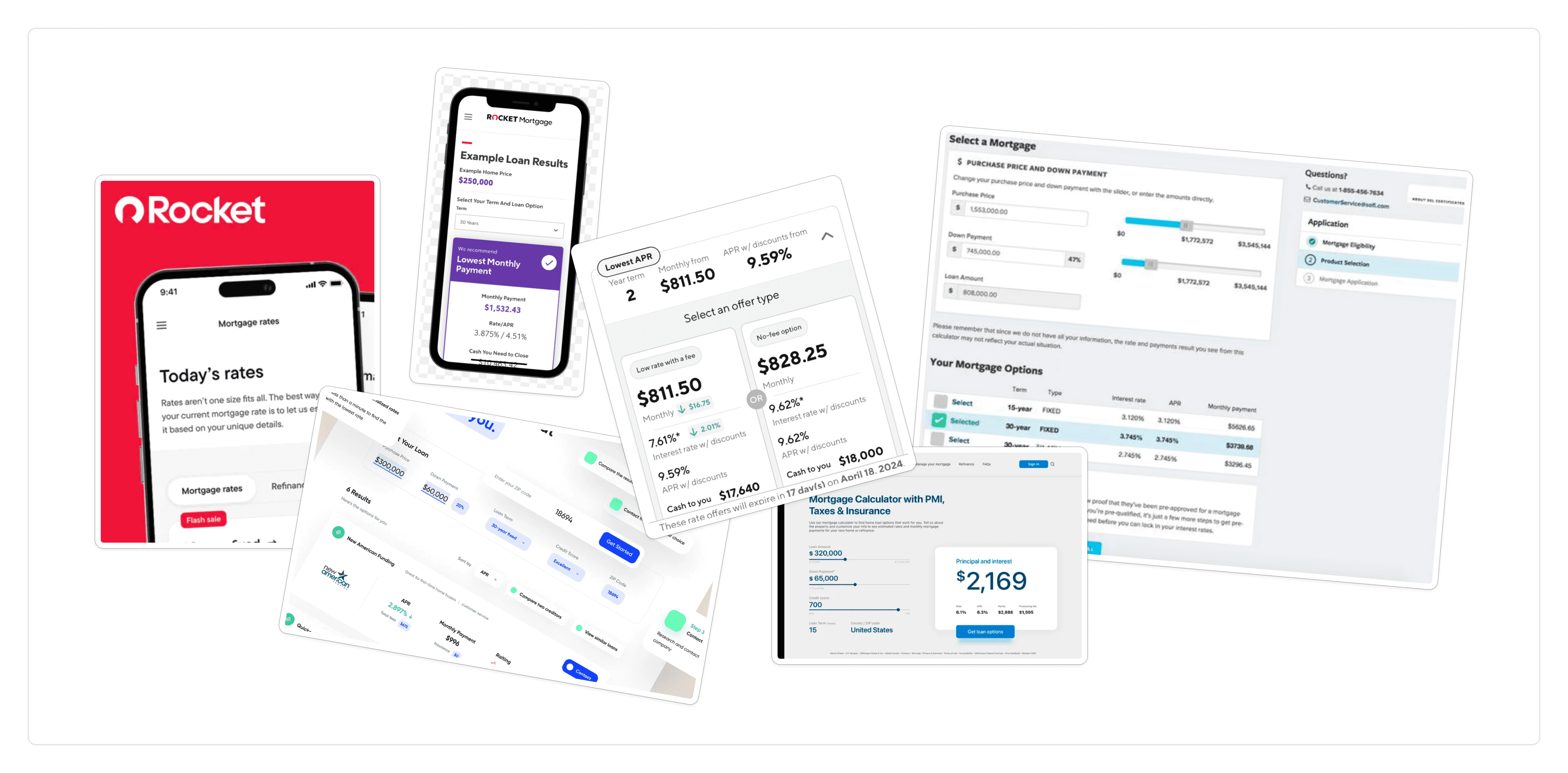
I did my competitive analysis on other real estate sites and non-competitors like Airbnb, primarily looking at how I'd approach hierarchy.
User Journey Mapping
I also mapped out the essential journey a user would take to get to this point, and where it would lead them.
Designing a smarter way to browse and compare scenarios
Navigation
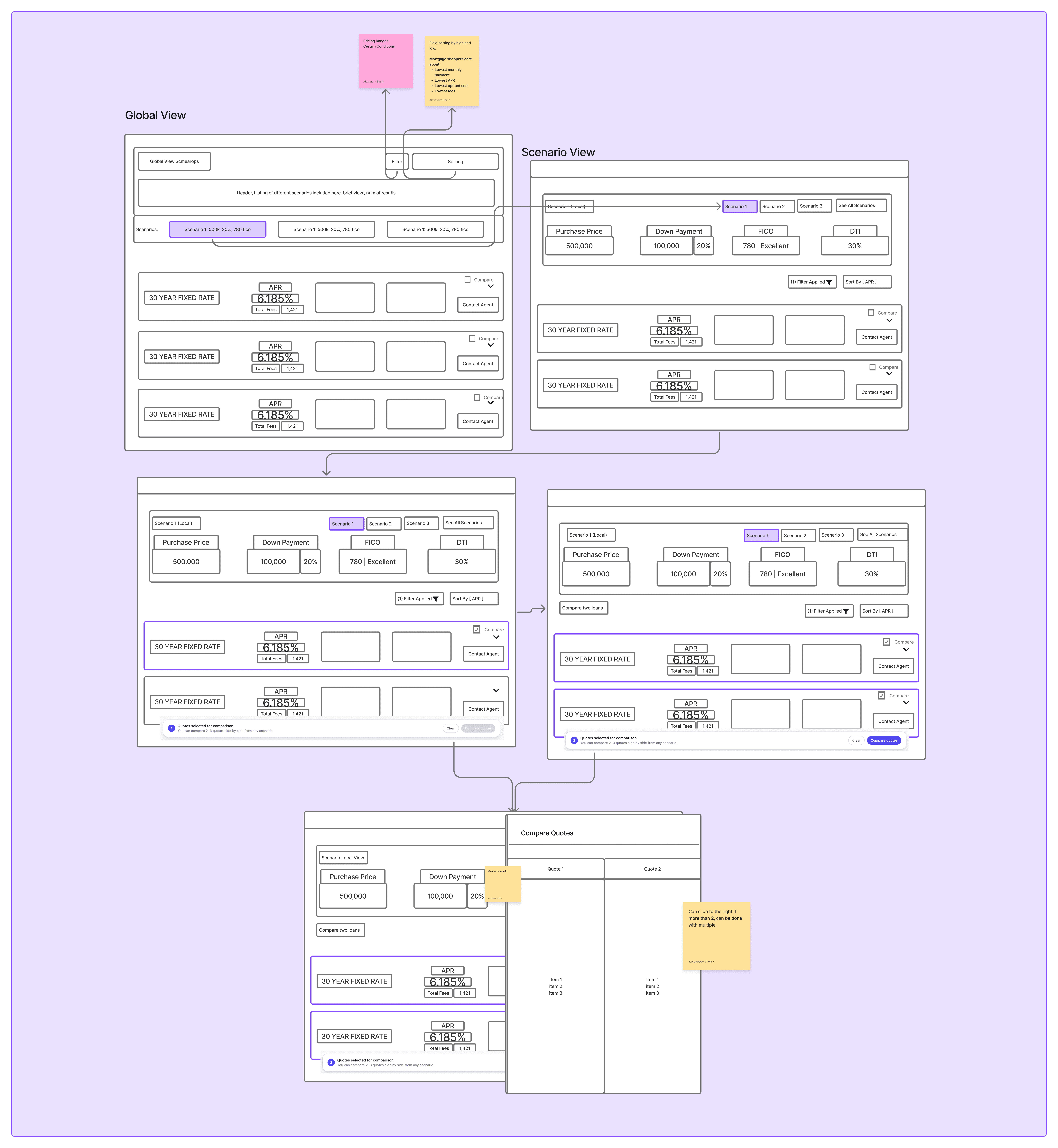
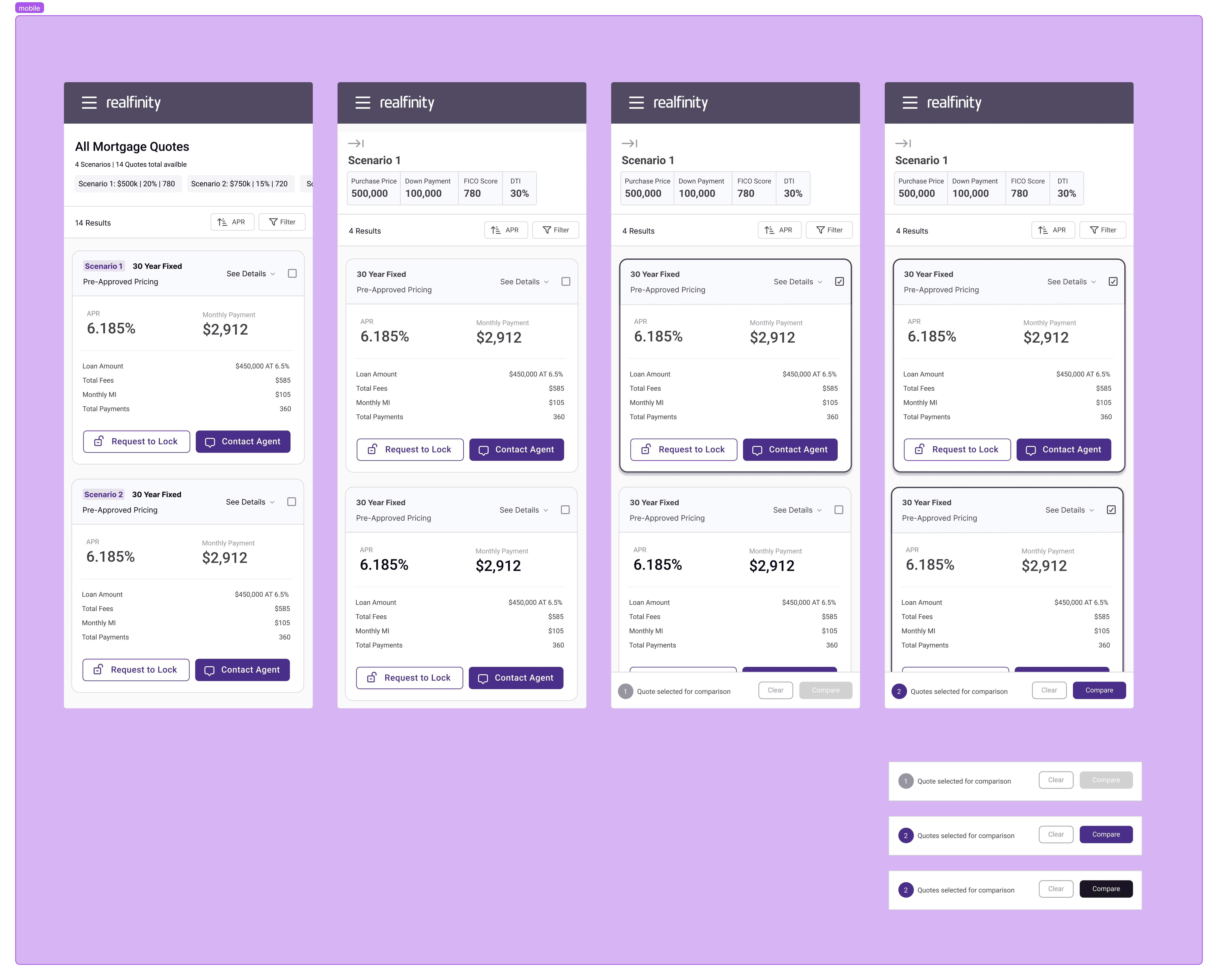
One thing I wanted to make more intricate was a smarter hero/navigation that would include the ability to parse through different scenarios easily. This meant thinking about filtering and sorting.
Before I arrived at this idea, I initially tried to consolidate scenarios into better collapsible states. But one of the project goals was to introduce a comparison feature — and if you imagine 3–5 scenarios, each with 5–10 quotes inside, it would impact the customer experience negatively. So I scrapped that idea and chose the smart nav instead.
It would have the current collection (holding all the specific scenarios with their rates), underneath which would be more context on the prices and percentages of the collection.

Rates (Cards)
My next focus was what the cards (rates) themselves would look like. I found the information hierarchy was already quite appropriate, given the established buyer persona would already be aware of most terminology.
The buyer could either be:
Familiar with certain (not all) jargon
Already confident in their decisions, and just wanted the best deal
Needed clarity for big emotional purchases
Redesigning the pricing quotes screen for clarity and mobile

By restructuring the informatio hierarchy on the cards and utilizing progressive disclosure for the remaining finer details, I could then focus on the comparison panel.
The objective was the ability to compare 2–4 quotes at a time, which led to the choice to either click a comparison button or start selecting quotes from any scenario (with a conditional "start comparison" modal at the bottom). This opened a side panel comparing each quote side by side — similar to established pricing mental models — on the most important metrics. It would also surface AI suggestions within the comparison panel to make the decision easier for the customer.
Challenges I faced along the way…
As a mature startup, things were always changing, so it was best to push a MVP and iterate going forward. Engineers were understandably averse to deep structural changes to the logic in such a fast-growing company.
One of the hardest parts of this challenge was understanding backend development constraints and what was actually feasible. I remember asking a software engineer to show me his code and walk me through how things were sorted in the codebase. My CS background helped a lot here — when I design, developer feasibility is one of my highest priorities. It's almost as if I can see what the code looks like while I design. I consider that a superpower rather than a restriction.
Transparency builds trust in life's biggest decisions"
I presented my work to the CTO and other developers across the team for feedback, and worked closely with my Product Design Lead to iterate on the design before pushing it to production.
With more time, I would have loved to do user testing with customers instead of relying only on internal reviews.
My key takeaways:
Transparency and trust go hand in hand.
A mortgage is one of the largest financial decisions most people will ever make.
If I had more time, I'd also want to dig deeper into AI's ability to make suggestions based on a customer's assumed priorities, drawn from their activity and conversations.