I designed a website for a baker's cookie dream. Originally, all their orders started simply from social media messaging.
Overview
Creating a structure around storytelling
A Miami-based bakery, Tres Leches, are selling unique tres leches cakes and cookies through Instagram. While visually appealing, ordering was limited to DMs, and customers lacked a streamlined way to browse menus, place orders, or view reviews/policies.
Problem
Doing delicously good research
Interviewing the owner
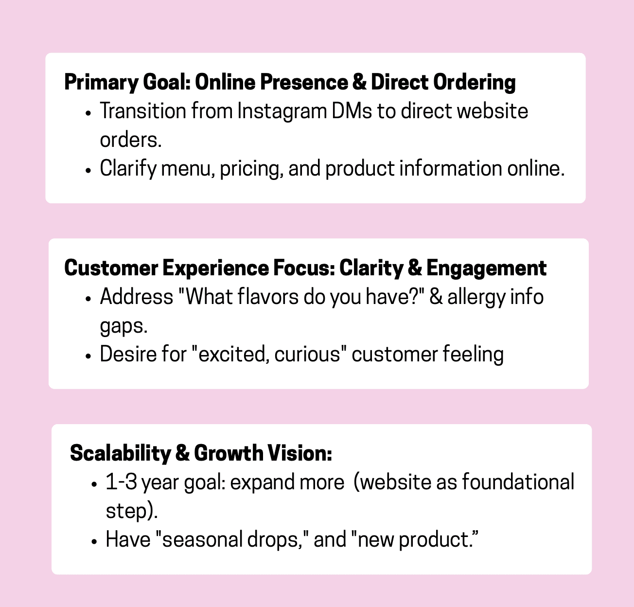
I started by understanding what mattered most to the owner — her product goals, themes, and overarching priorities. With KPIs established, I wanted to better understand her customers, so I ran a research survey and gathered these insights:
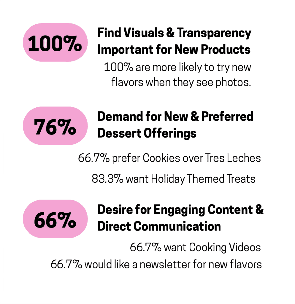
Research survey: Surveying 12 past customers, key results included:
Competitive analysis
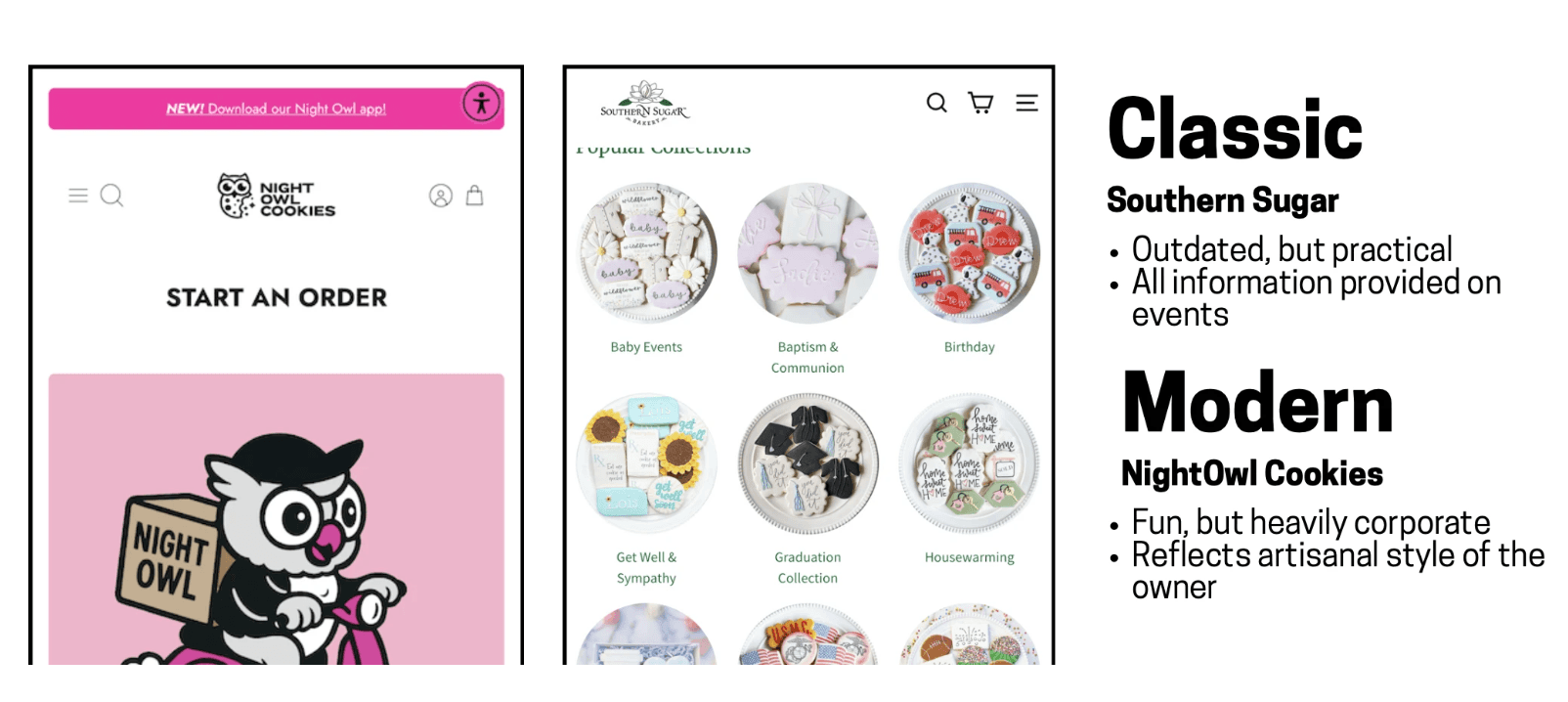
From there, I analyzed local competitors in the area, both large and small. I wanted to look past traditional e-commerce sites and pay attention to how different companies handled personalization.
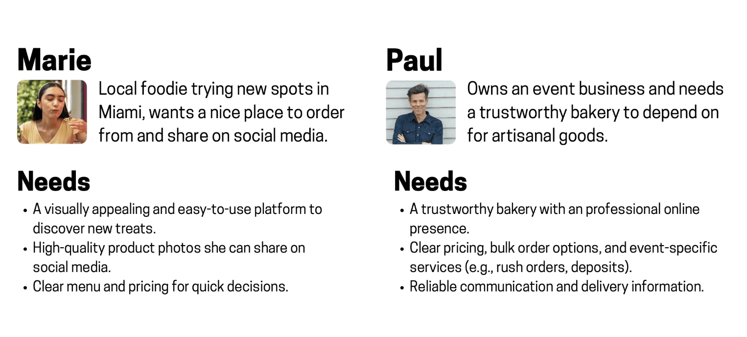
Personas
I developed two main personas to help expand the bakery's reach. These emotional needs shaped the type of content and design priorities the site required.
Ideation
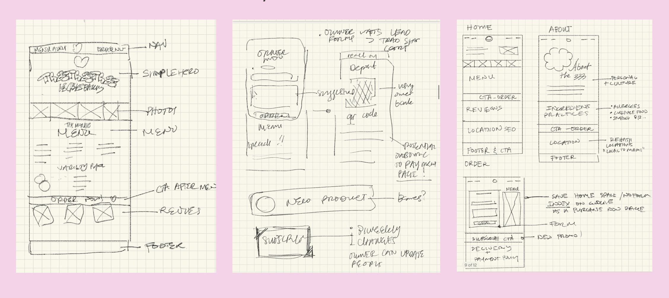
The process began with many rounds of ideation —
I did plenty of sketches and hierarchy concepts for positioning.
I initially got excited about designing an elaborate, artisanal experience for the bakery, but the concept quickly became cluttered. I scrapped it and started fresh with a simpler, less visually busy direction.
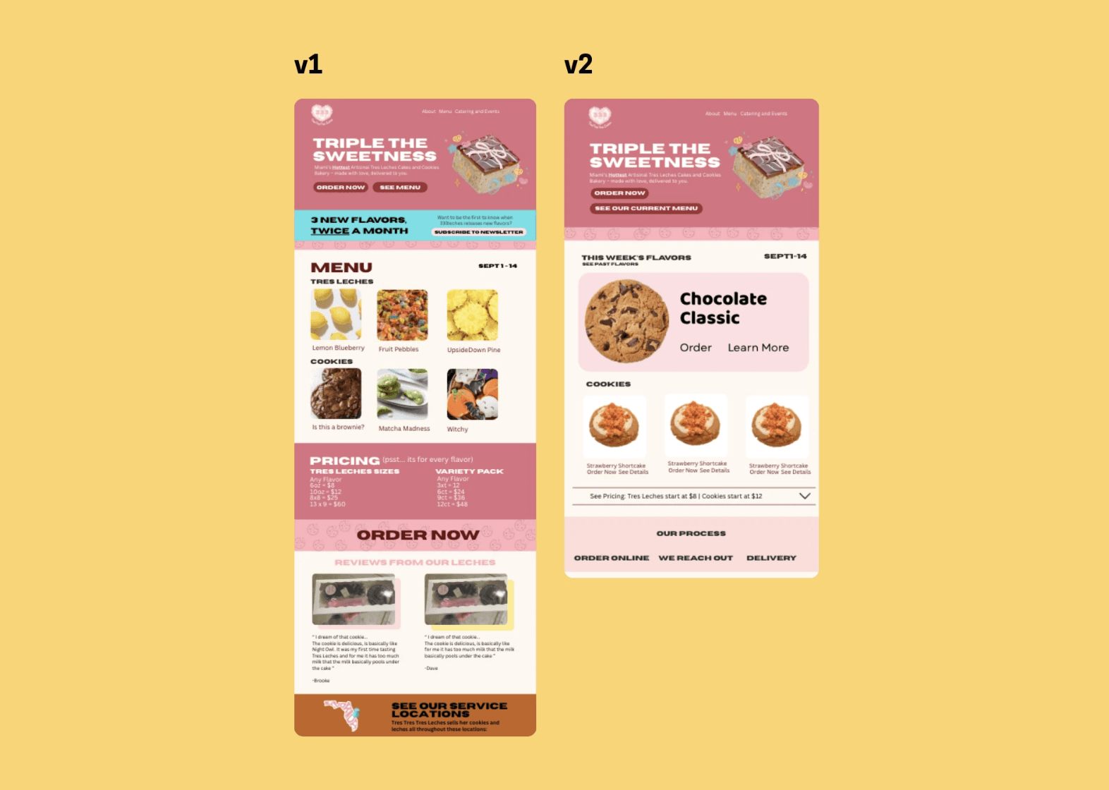
Takeaway: I quickly learned that less is more when it comes to selling an experience — let the products speak for themselves.
Design
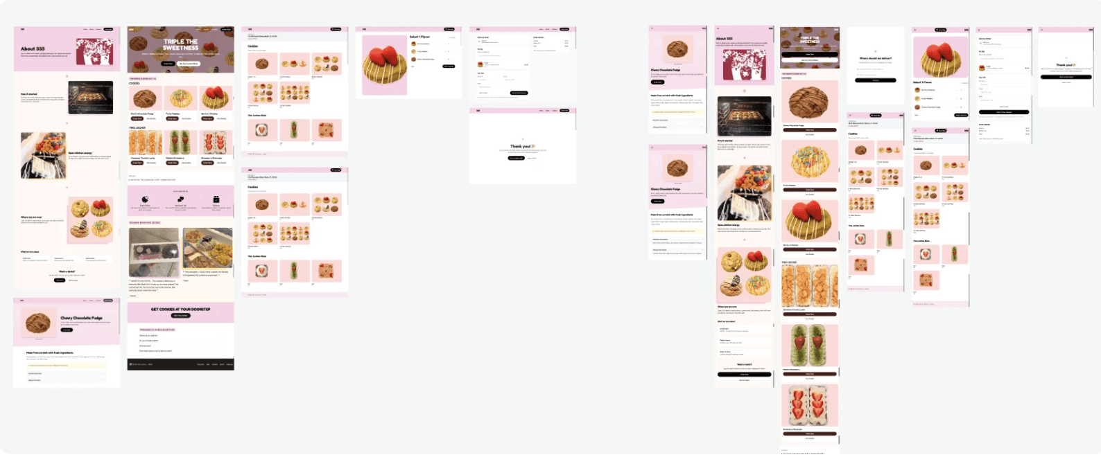
From wireframes, I moved into prototypes.
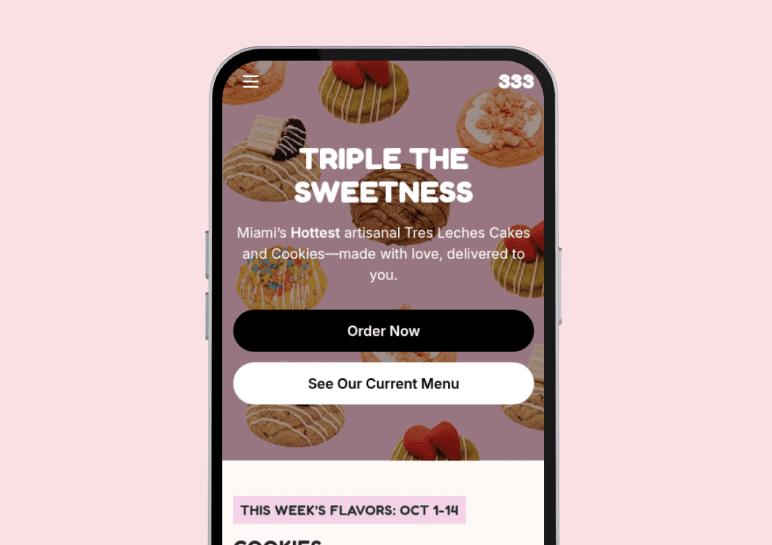
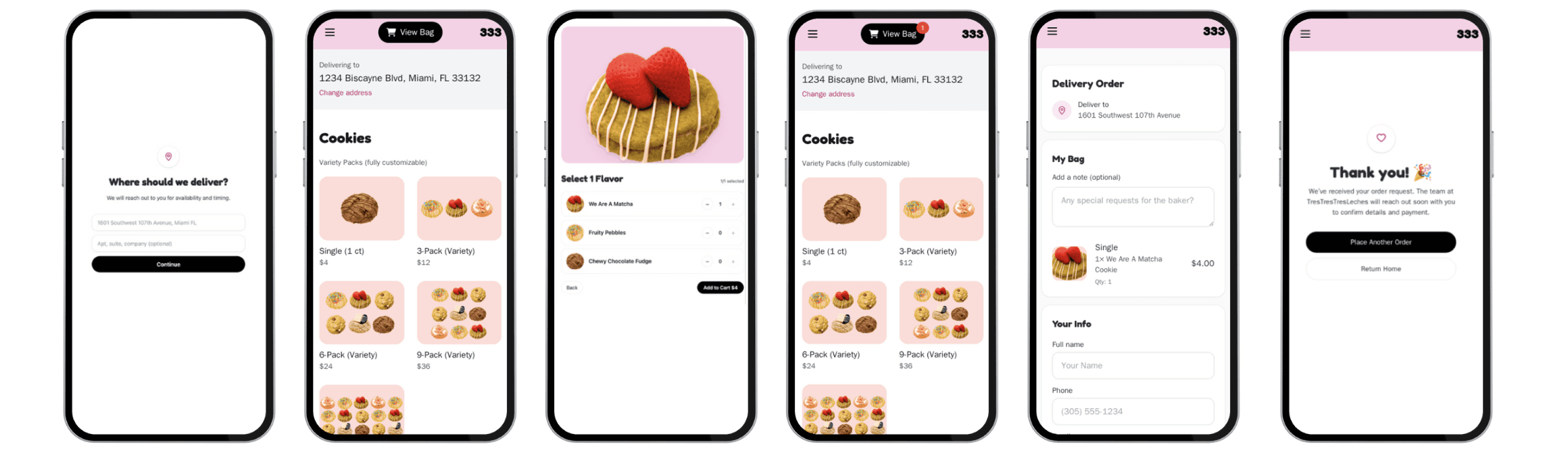
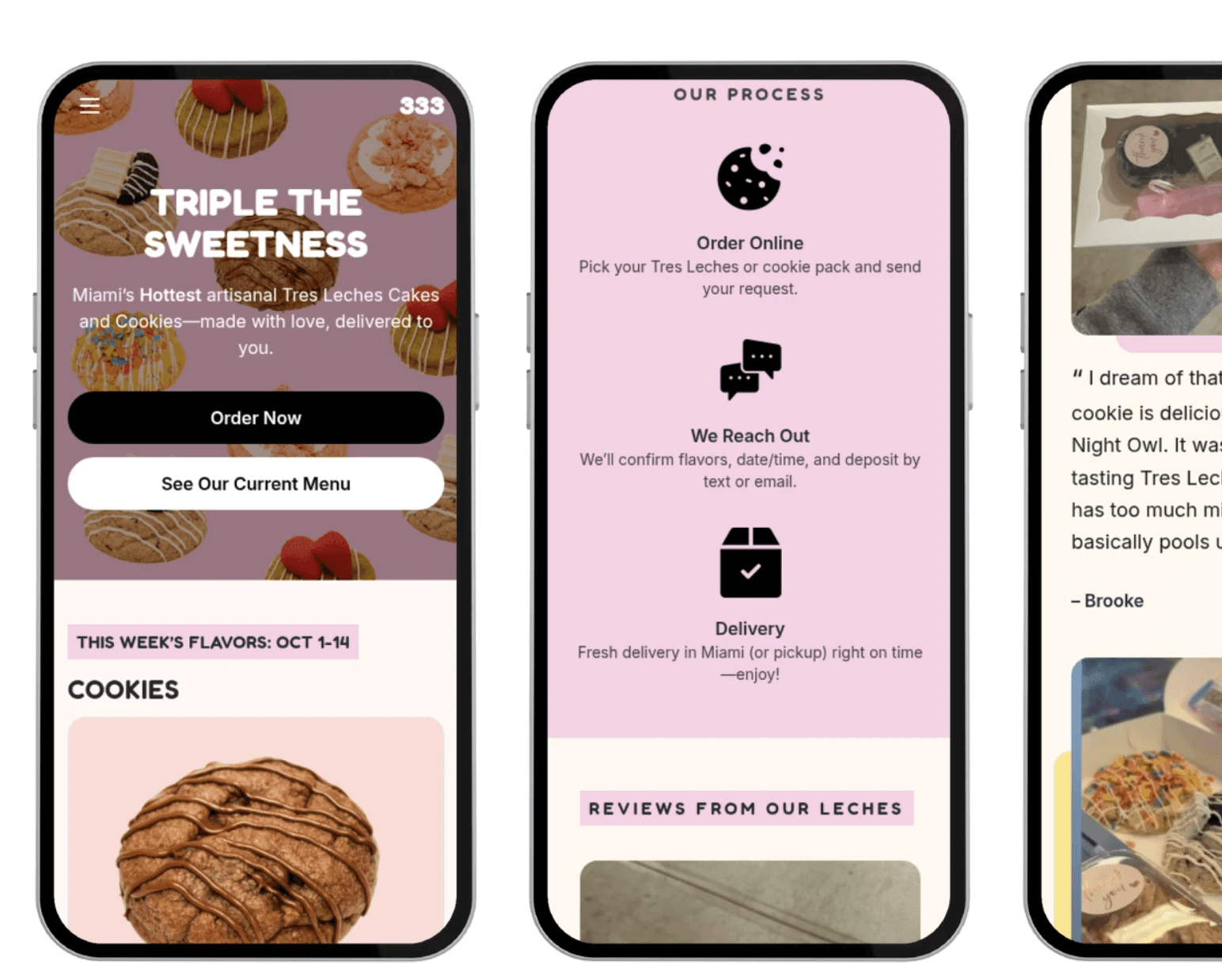
SEO & Content
Beyond aesthetics, I focused heavily on content hierarchy and discoverability. The website was structured around SEO-informed keywords, clean metadata, and descriptive alt tags for every product photo — improving accessibility while also supporting organic discovery through search engines.
User testing told us that…
11 out of 12 returning customers preferred the new experience
6 new customers placed first-time orders directly through the site
Takeaways
Most times, less is more...
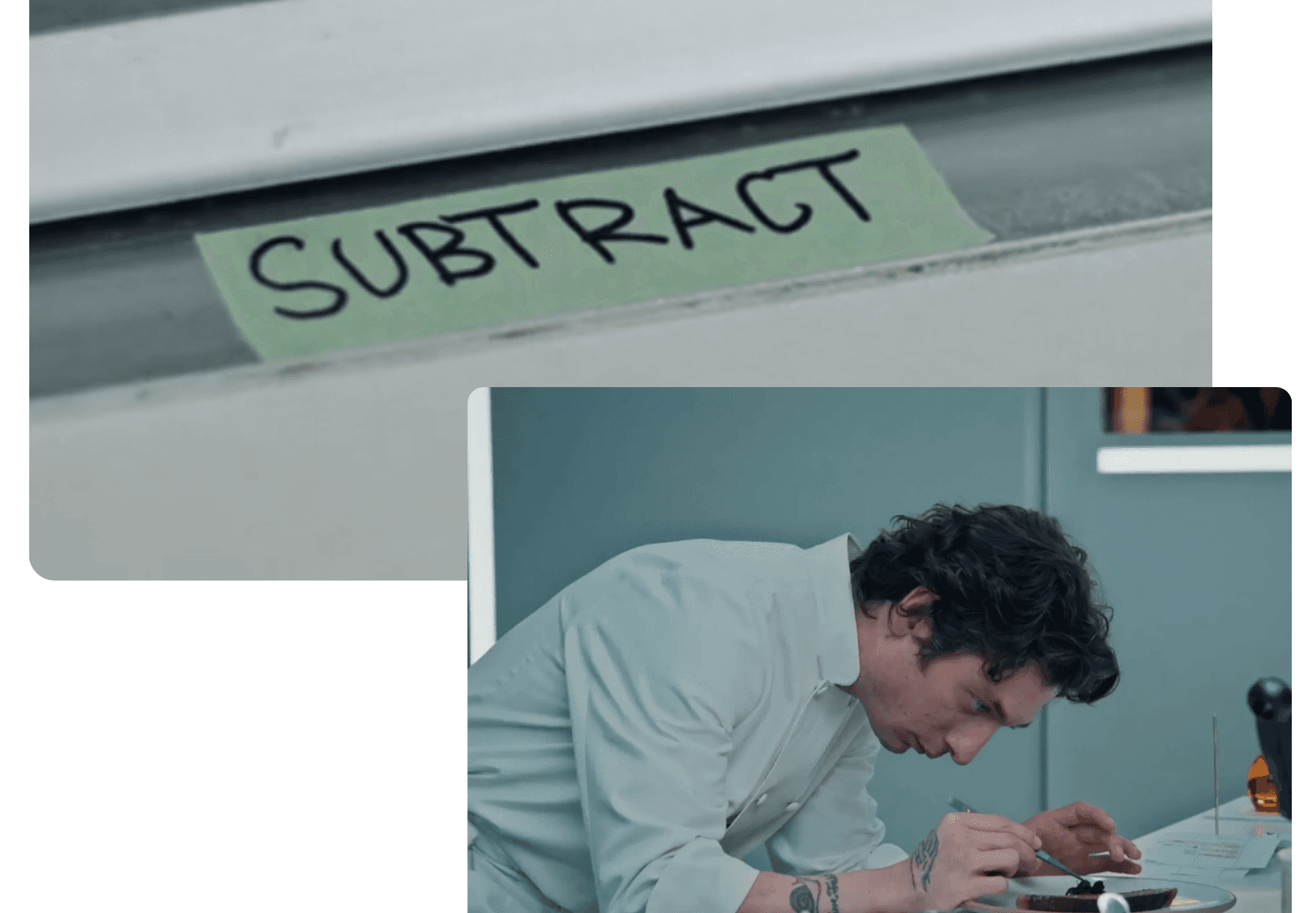
Working on Tres Leches reminded me of a moment from The Bear — a chef realizing that good design, like good food, often comes from subtraction rather than addition. That idea became my mantra for this project.
I learned that digital transformation doesn't always mean adding complexity. Sometimes, it's about clarity — about making the technology disappear so the product can speak for itself.